
Why line thickness matters before the die is engraved
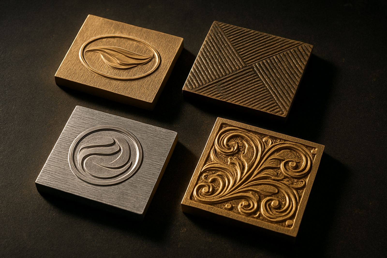
In hot stamping, the artwork does not stay on a screen or monitor, it becomes a physical tool. That means every line width, gap and corner has to survive engraving, heating, pressure and the stock itself. A line that looks fine at 100 percent on screen can disappear once it is cut into brass or magnesium, especially on small logos, fine borders and detailed lettering.
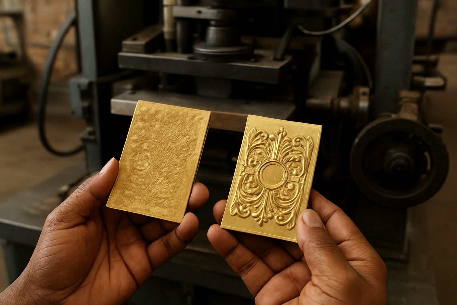
For print finishers in Johannesburg, Pretoria and Durban, the most common issue is over-detail in a design that was meant for foil stamping or embossing. The narrower the line, the more sensitive it becomes to dust, plate temperature, foil release and uneven packing. If the artwork is being prepared for a packaging job with a short run and a tight deadline, it is better to simplify early than to correct after the first sample, because rework costs time and money.
Practical line and gap ranges that usually hold up better
Exact tolerances depend on the substrate, the press, the finish and the size of the design, but there are useful working ranges that keep jobs sensible. On most jobs, slightly bolder line work gives more reliable results than ultra-fine detail. Small gaps between letters, rules and decorative marks also need breathing room so the stamped image does not close up when heat and pressure are applied.
- Use heavier line weights for tiny artwork rather than trying to preserve hairline detail.
- Keep internal gaps generous enough for the engraved edge to stay visible after stamping.
- Avoid very tight spacing in borders, monograms and repeated patterns.
- Allow extra room in artwork that will be stamped on textured board or coated packaging stock.
- For very small copy, test whether embossing depth and foil coverage can still be read clearly.
As a rule, clean geometry performs better than busy detail. If a line is only just visible on a proof, it may be too thin for practical die work. It is also worth remembering that some stocks compress more than others, so the same line thickness can behave differently on folding cartons, rigid board or smoother labels.
How stock choice changes the line thickness you can use
Artwork line thickness is not judged in isolation. A design for soft, absorbent board behaves differently from one intended for coated packaging or laminated material. On heavier paper and board, small details may lose clarity because the fibres compress and the finish can spread slightly. On coated surfaces, very fine marks may hold better, but they can still fail if the die is overworked or if the foil release is uneven.
In coastal areas like Durban and Gqeberha, humidity can also affect the final impression and how the stock responds during handling. In dry inland conditions such as Johannesburg and Pretoria, the paper may behave differently again, especially on long runs where load-shedding and temperature changes can interrupt production flow. That is why the line thickness in the artwork should be matched to the real production environment, not only to the visual concept.
Simple checks to do before sending artwork for a die
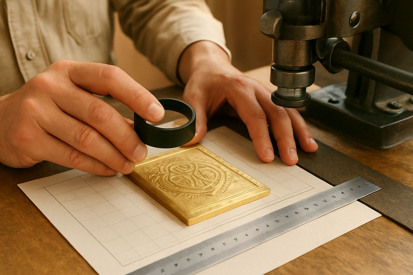
Good artwork checks save time later. Before engraving starts, it helps to review the file for line weight consistency, minimum gap size and any tiny elements that may break down in production. A die can only reproduce what the artwork allows, so a quick prepress review is often the difference between a clean first strike and a messy correction.
- Check that all lines are visually consistent across the whole layout.
- Look for tiny gaps inside letters, icons and frames.
- Make sure reverses, counters and small cut-outs are not too tight.
- Confirm whether the design is for embossing, hot foil or a combined finish.
- Ask for sample impression advice if the job is unusual or very detailed.
If the artwork includes thin rule lines around a logo, it may be worth strengthening them slightly so the finished die reads more cleanly. The same goes for fine serif typefaces, small text and delicate ornaments. These can look elegant on screen but become hard to read once heat and pressure are applied.
A Johannesburg packaging example with a cleaner outcome
A packaging house in Industria sent through a carton design for a premium insert, with a fine border, small crest and tight lettering around the edge. On screen it looked neat, but the border was too narrow and the gaps around the crest were too close for dependable engraving. After reviewing the artwork, the lines were thickened slightly and the spacing opened up just enough to keep the detail alive.
The revised die produced a cleaner impression on the first sample, and the finisher avoided extra setup time. That sort of adjustment is common on urgent jobs where the client needs repeat ordering or a quick turn around for a launch. In practice, a modest change to line thickness can save a whole production day, especially when the job has to be couriered nationwide and the window for corrections is short.
What to ask for when the artwork is borderline
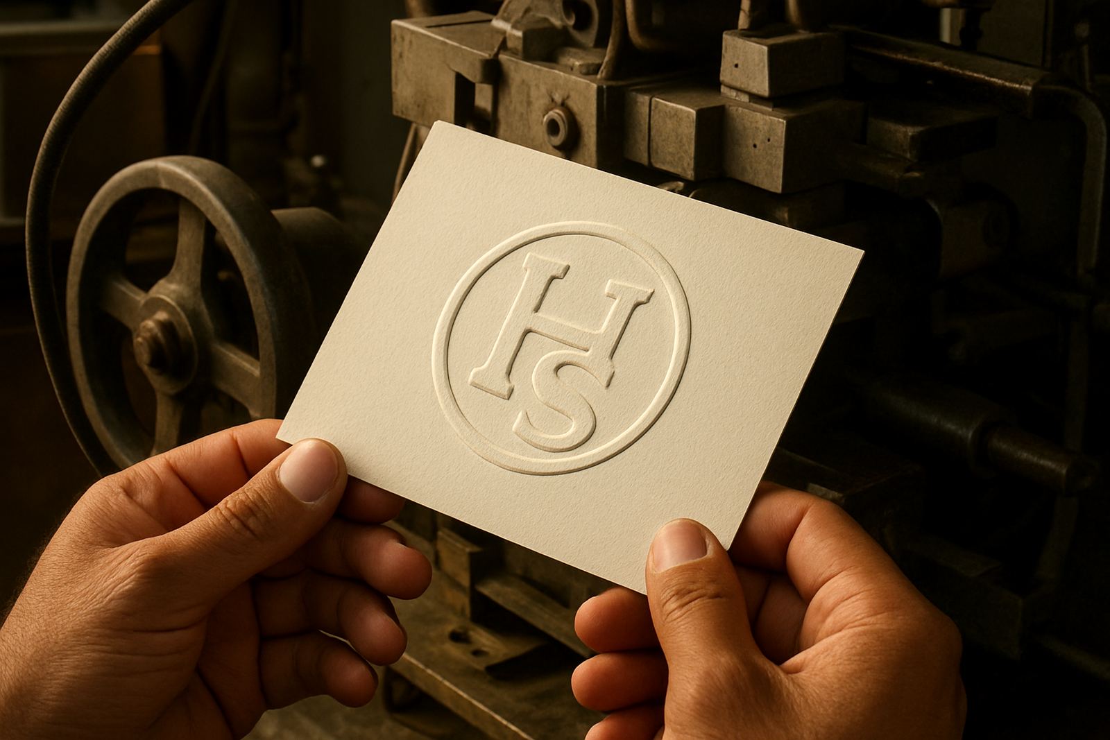
If the design is already tight, do not assume it will work just because it is visually balanced. Ask for a proper review of line thickness, counterforce matching and possible die alterations before production starts. That is particularly important for jobs with embossed initials, fine packaging marks or small repeat artwork where the same detail appears many times.
Our team in Johannesburg handles artwork checks, die design, engraving production and dispatch for print finishers and packaging houses across South Africa. We also help with job filing, die cleaning and damage assessment so repeat jobs can be handled consistently. When the artwork needs a decision on line thickness, it is better to resolve it at the start than to try and rescue it after the first impression, because once a line is too fine it usually stays that way.