
When a quiet finish carries the strongest message
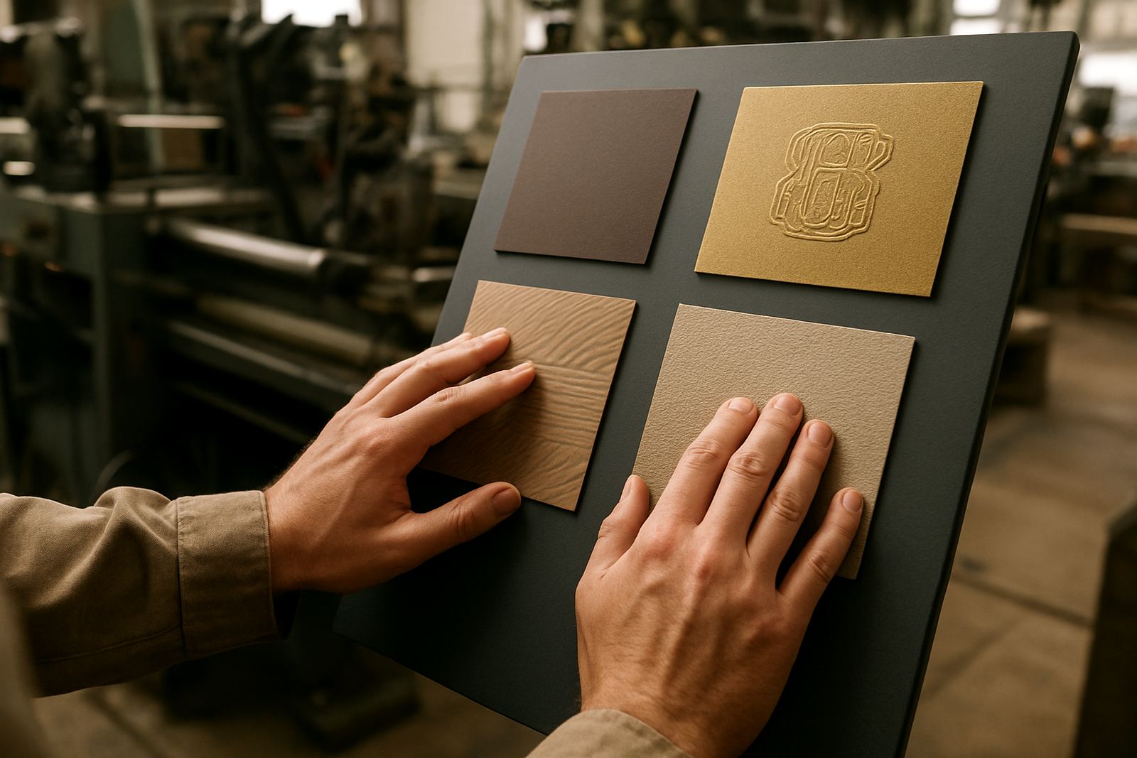
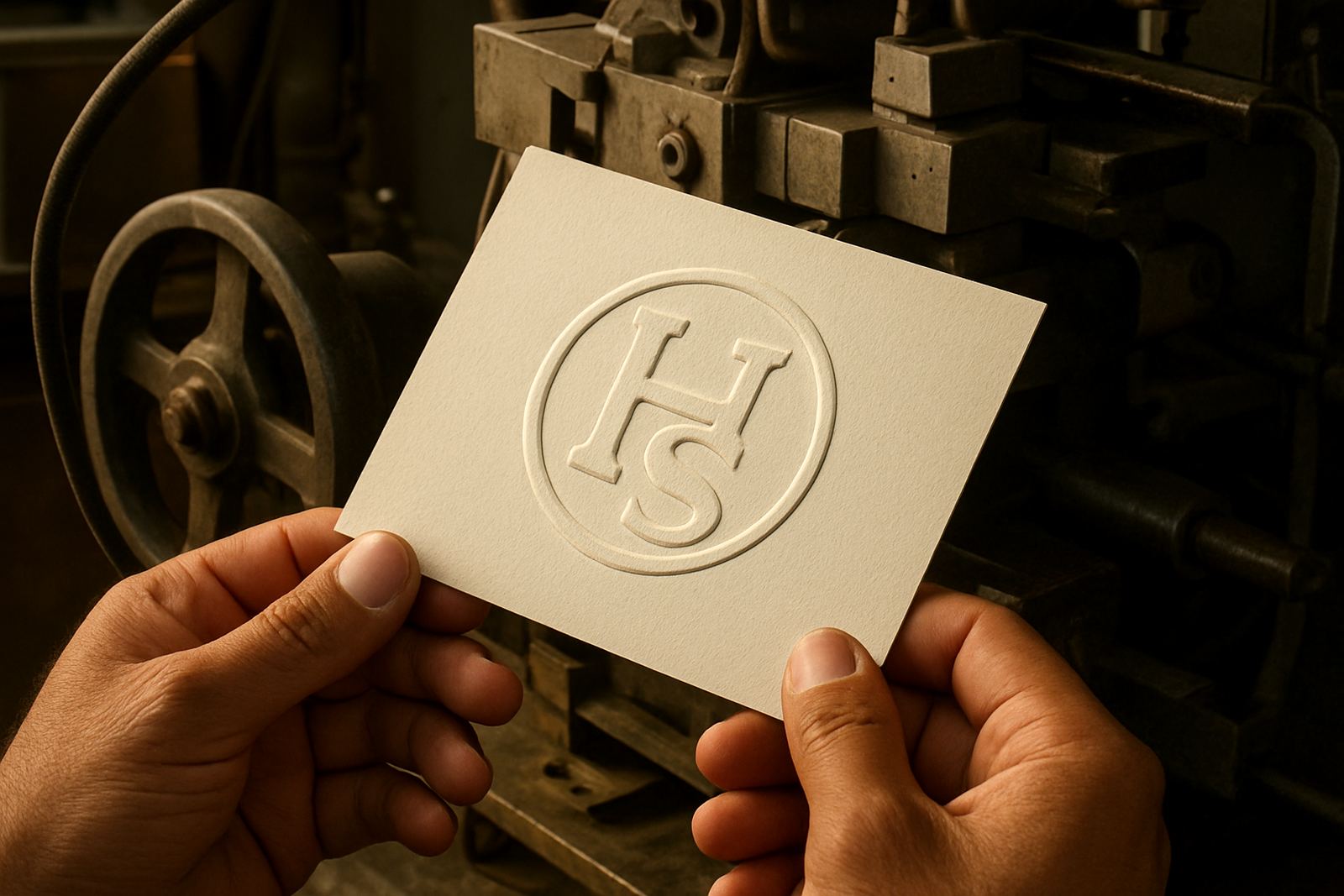
Blind embossing is ideal when you want the shape of a mark, not extra colour. It lifts or presses a design into paperboard, card, leatherette or other receptive stocks so the texture does the talking. For brands that want a cleaner, more restrained look, it gives you presence without shouting.
This finish suits print work where the surface quality matters just as much as the printed image. A crest, monogram, border line or product name can all gain depth through a well-made die and matched counterforce. The result feels considered and deliberate, especially on packaging that sits on a shelf in stores, salons or boardrooms.
Best applications for blind embossing in South Africa
Blind embossing shows its value across many print finishing jobs. It is especially useful where the client wants something more tactile than a printed block of colour, but does not want foil or heavy ink coverage. In Johannesburg and other major centres, we see it used on short-run packaging and premium presentation items as often as on larger repeat work.
- Cosmetics cartons and skincare sleeves
- Wine and spirits packaging
- Corporate presentation folders
- High-end invitation cards and certificates
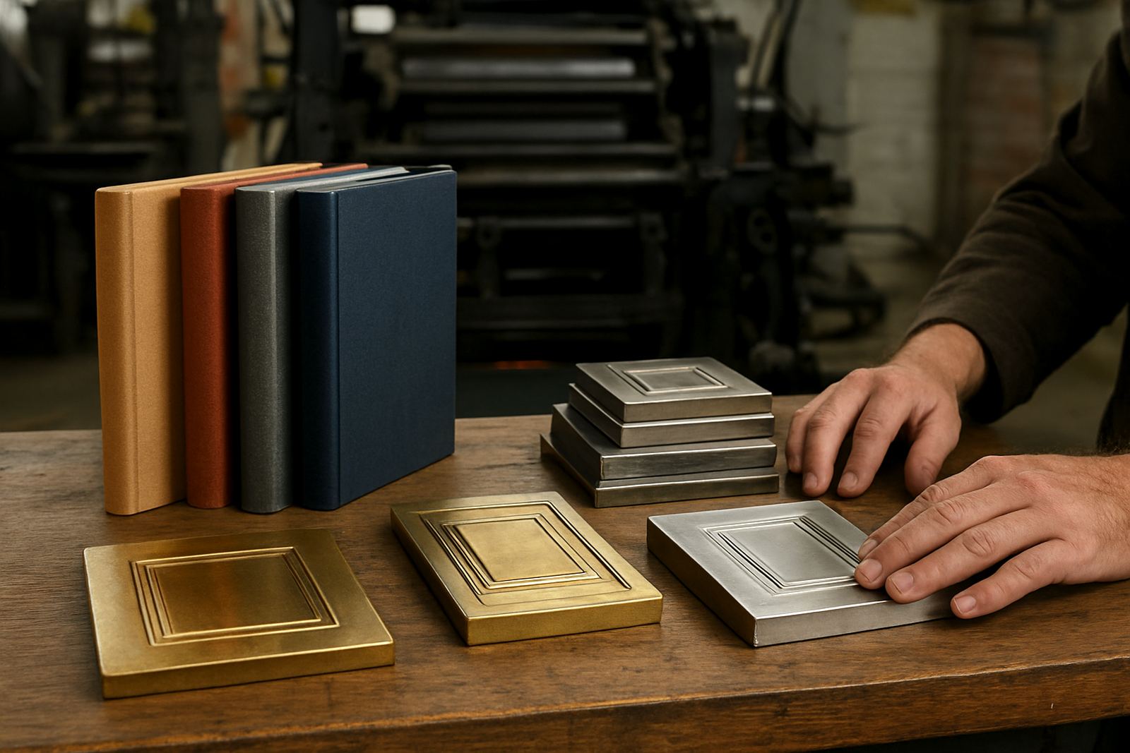
- Book covers, title pages and end sheets
- Retail swing tags and product labels
For packaging houses handling regular reprints, blind embossing is also useful because it can be kept consistent across repeat orders when the die is stored and filed properly. That makes it easier to maintain the same tactile identity across different product batches.
Why the stock choice matters more than most people think
Blind embossing depends heavily on the paper or board. A soft stock with enough fibre body will usually take a clean impression, while very thin or brittle material may crack or flatten out. Coated board can work well too, but the depth and detail need to be planned with the finish in mind.
We often advise clients to think about the entire job, not just the design. If the stock is too light, the emboss may look weak. If it is too thick or too dense, the fine detail can lose definition. A proper artwork check and sample impression advice can save time and avoid expensive rework later.
- Heavier board usually holds deeper relief better
- Fine line art needs more careful die design
- Small text may fill in if the counters are too tight
- Uncoated stocks often show the best tactile contrast
- Creased or cracked material can spoil the final result
Where blind embossing works better than foil or ink
Not every job needs shine. In some cases blind embossing is the better choice because it feels premium without adding another production step. That can be useful when the brand wants quiet confidence, or when the layout already has a lot happening in print and the finish needs to stay restrained.
It is also a practical option when the design must remain legible under different lighting conditions. Embossed detail catches natural light, office light and shop lighting in different ways, so the mark stays visible without depending on metallic foil or a strong printed colour. For some brands, especially in legal, property, craft spirits and boutique goods, that subtlety matters.
Local example from a Johannesburg packaging job
A packaging house in Industria may be producing carton sleeves for a boutique food range headed to stores in Pretoria, Durban and Cape Town. The client wants the logo on the front panel to feel refined, but the artwork already carries a lot of colour and small type. Blind embossing is a practical solution because it adds detail without crowding the layout.
In a job like that, the die needs to be precise and the counterforce matched carefully. The artwork must be checked for line weight, spacing and any tiny elements that could disappear under pressure. If the stock is coming from a humid coastal supplier or the goods will be stored in changing warehouse conditions, the finishing team also has to allow for how the board behaves after delivery. A clean blind emboss on the first run can save a lot of packagin problems later.
- Keep the embossed area away from fold lines where possible
- Allow enough margin so the impression does not distort the edge
- Test the stock before full production if the run is large
- Use repeat filing so the same job can be reordered quickly
What makes a good blind emboss die
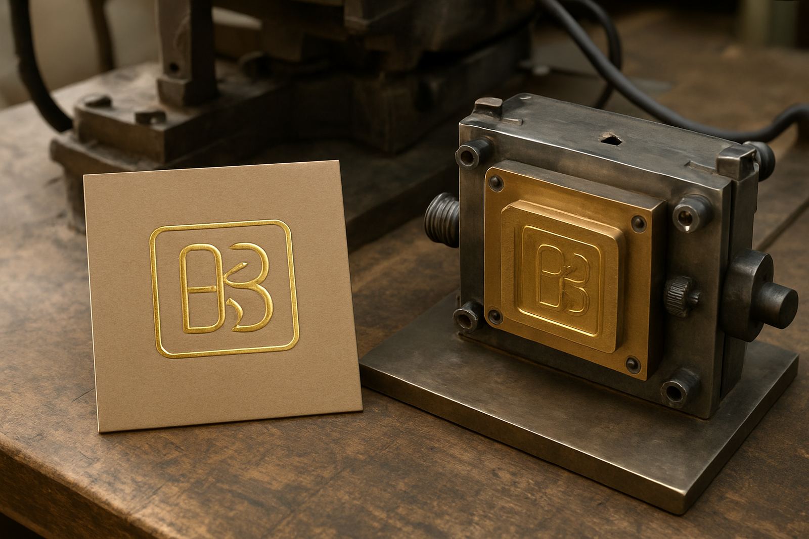
The quality of the die is what separates a crisp finish from a weak one. Brass dies are often chosen when extra durability and fine detail are needed, while magnesium dies can be useful for certain production requirements and quicker turnaround work. The right choice depends on the stock, run length and the level of detail in the artwork.
Good die work is not only about engraving. It includes artwork checks, die design, counterforce matching, and making sure the finished piece will press cleanly on the actual machine setup. For print finishers handling frequent jobs, having the die filed properly makes repeat ordering and die alterations much easier.
- Clear artwork with correct sizing and spacing
- Accurate engraving depth for the chosen stock
- Matched counterforce for even pressure
- Careful packing dispatch to protect the die in transit
Planning blind embossing for urgent or repeat work
If a client needs a quick turnaround, it helps when the job is prepared properly from the start. Missing artwork details, unclear sizes or poor stock choice can slow things down more than the embossing itself. A well managed order means the production team can move from approval to engraving without unnecessary back and forth.
For repeat work, keep a record of the exact size, stock and press setup used the first time. That makes ordering faster and helps keep the finish consistent whether the job is heading to Johannesburg, Gqeberha or Polokwane. With the right job filing and careful dispatch, the same blind emboss can be run again with confidence when the next batch is due.