
Why texture needs a measured hand
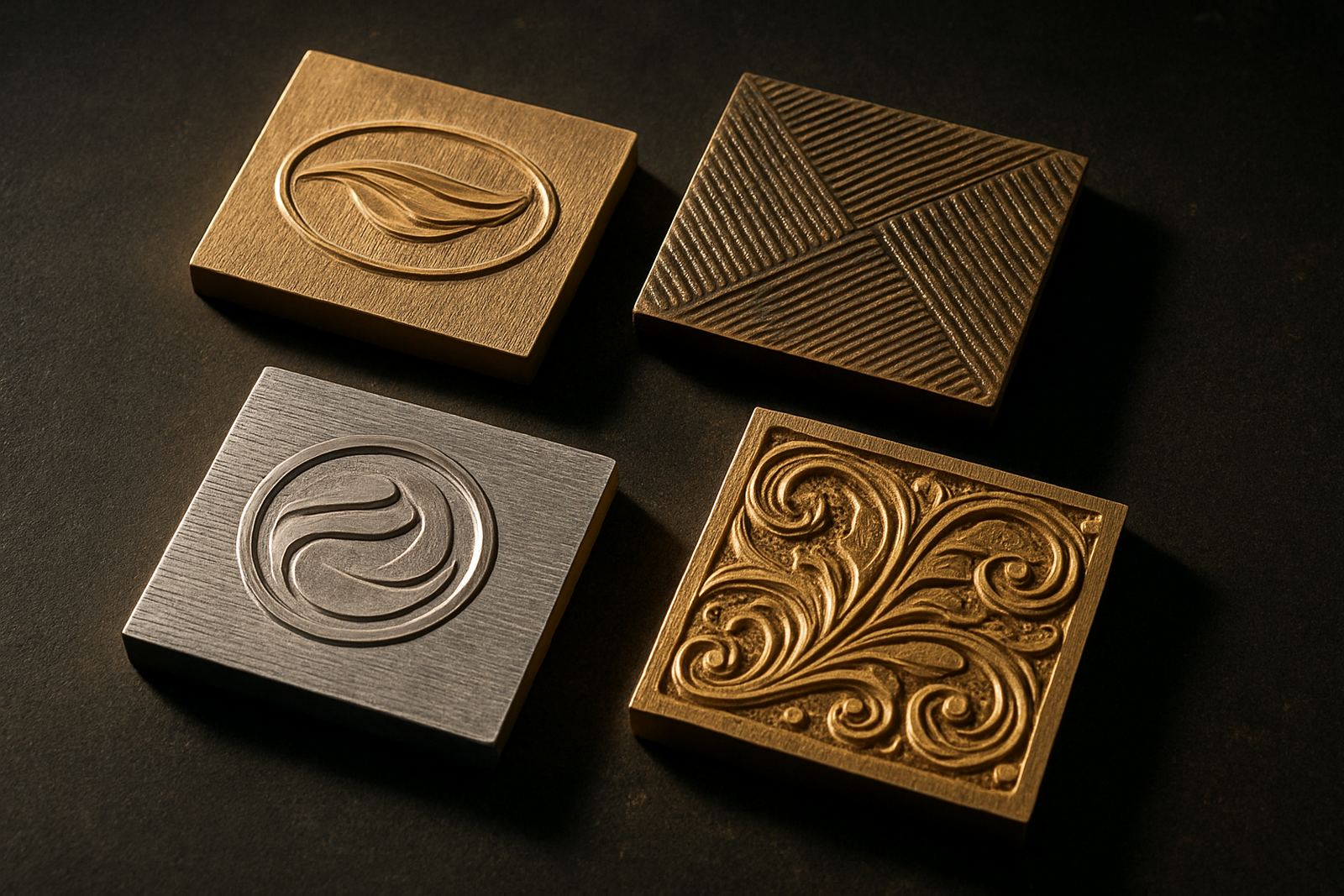
Texture works best when it supports the message, not when it competes with it. A soft grain around a crest, a patterned border on carton sleeves or a raised brand mark on luxury packaging can lift the look of a job, but once the detail gets too tight the stamp starts to lose definition. In hot stamping, the smallest line can close up if the artwork is crowded, the backing is wrong, or the die face is not matched to the stock thickness.
In Industria and across the country, we see the same issue on short-run and repeat work alike: a client wants richness, then discovers the fine type has filled in after press setup. That is why artwork checks matter before engraving begins. The aim is not just a pretty finish, it is a readable finish that holds up on the press and in real handling.
The three detail killers: pressure, stock and heat
Most blurred texture comes from one of three things. Too much pressure forces the foil into places it should not go, rough stock steals definition, and uneven heat makes the image patchy. On coated board the result can look crisp, while on uncoated or fibrous stock the same artwork may need heavier line weights and wider spacing. Coastal humidity in Durban can also change how a sheet behaves, so the same job that ran clean in winter may need a fresh sample impression in summer.
- Keep fine serif text slightly larger than you think you need.
- Avoid very tight hatching in shaded areas.
- Leave breathing room between decorative texture and key text.
- Ask for sample impression advice before full production if the artwork is dense.
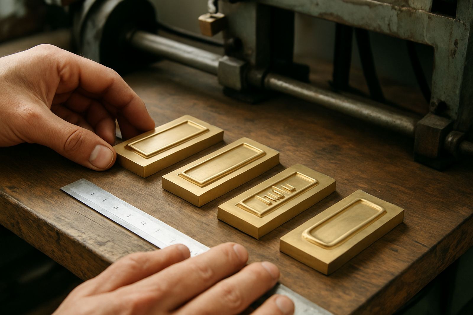
When the stamp is made from brass or magnesium, material choice also affects how much detail can be held. Brass is often preferred for longer runs and finer definition, while magnesium suits many lighter jobs where turnaround matters. The correct choice depends on the artwork, the stock and the production pace, not on guesswork.
How to keep logos readable inside decorative artwork
The cleanest stamped pieces usually separate the logo from the texture rather than forcing both into one busy field. A logo should have a clear edge, a stable centre and enough open space around it. If the lettering is too thin or the negative space too narrow, the counterforce can crush the shape and you lose the brand mark altogether.
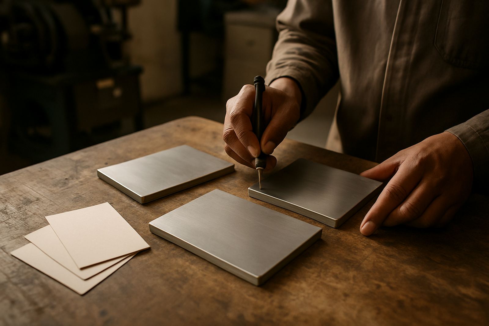
For packaging and print finishing jobs, we normally suggest building the artwork in layers. Use one line weight for the main brand name, another for border detail and a third for background texture if needed. That makes the die easier to engrave and the press setup easier to control. It also helps when the same image has to be repeated across cartons, sleeves or labels.
- Bold the key word or initials in the mark.
- Use texture in the background, not through the letters.
- Keep tiny type away from deep emboss areas.
- Check whether the reverse side of the stock can tolerate the impression.
What a sample impression should tell you
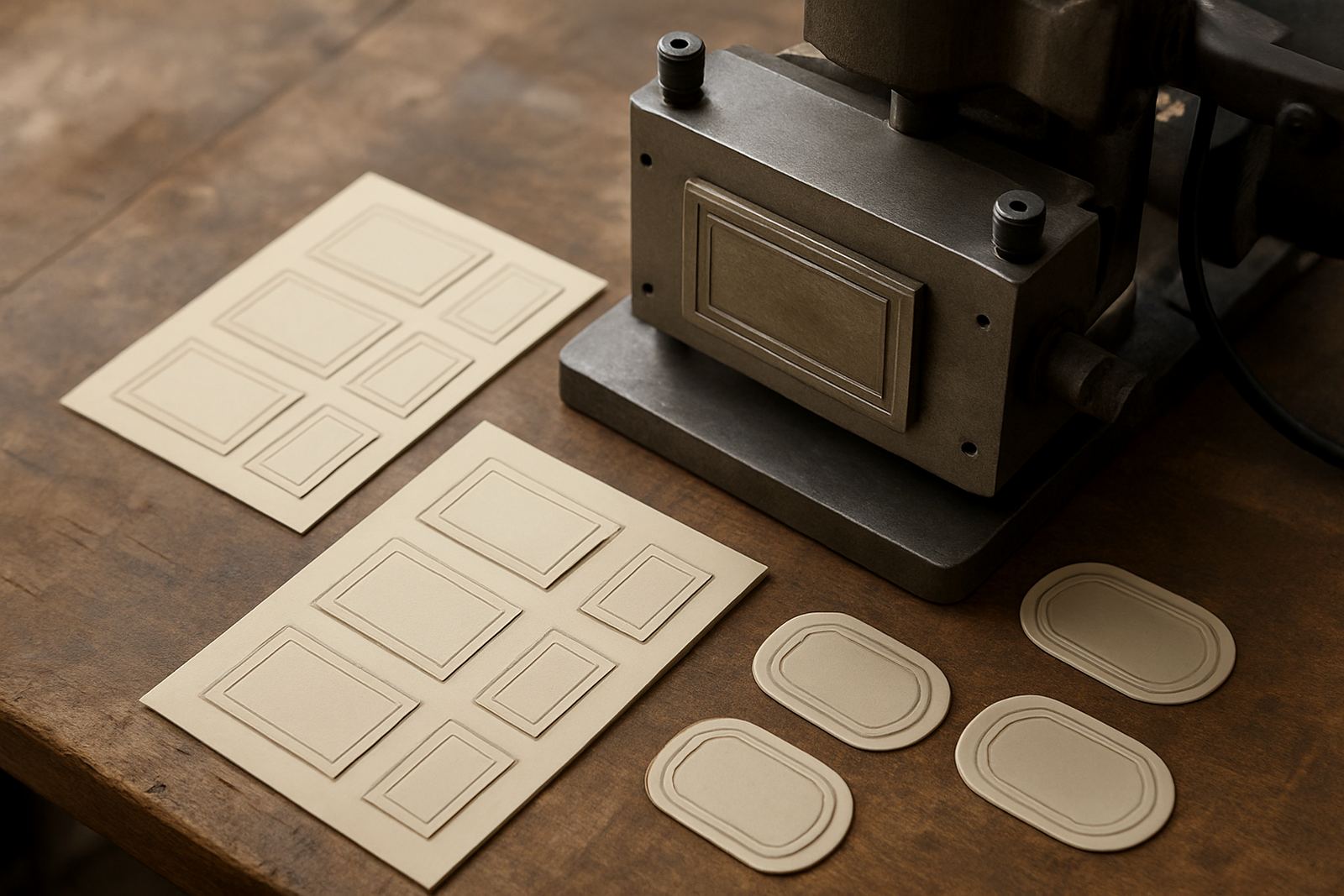
A sample impression is not just a formality, it is the quickest way to see whether the detail survives the process. It shows you if the pressure is too heavy, if the edges are too sharp, or if the artwork has become overcrowded. It also helps with counterforce matching, which is often the difference between a crisp raised mark and a flattened one.
Good sample checking looks at more than the front face. You should inspect the reverse side, the foil lay, the corners, and the repeat consistency. If the first pull is good at the centre but weak at the edges, that points to uneven pressure or press setup. If the fine lines are clean but the texture is muddy, the die may need adjustment before the full run goes ahead. A little time spent here saves rework later, which is especially useful when dispatches need to go from Johannesburg to Pretoria, Cape Town or Gqeberha without delay.
Local example: a carton run that needed both class and legibility
A packaging house in Johannesburg recently needed a textured embossing plate for a premium sleeve going out to several retail outlets. The artwork had a decorative border, a small logo and a batch code that had to stay readable for internal tracking. The first artwork file was attractive, but the border lines sat too close to the text and the code would have disappeared once pressure was applied.
After an artwork check, the design was opened up, the line weights were adjusted and the emboss depth was reduced slightly. The result was cleaner, and the client could still get the textured feel they wanted. The job was then filed for repeat ordering so the same setup could be made again without starting from scratch. For busy printers, that kind of control is practical, not decorative. It keeps the next run faster and the finish more consistent.
Practical habits that protect detail over repeated runs
Repeat work is where small faults show up. A die that was fine on the first run may need cleaning, alteration or damage assessment after a few heavy cycles, especially if the pressroom has been under load-shedding pressure and the setup has been rushed. Keeping the job file in order helps a lot, because old measurements, artwork notes and counterforce details can be pulled back quickly when the same client reorders.
- Store final artwork and production notes together.
- Use the same reference points for every repeat order.
- Check for wear before the next dispatch.
- Ask for urgent turnaround only when the press schedule can handle it.
For teams in Johannesburg, Pretoria, Durban, Cape Town, Polokwane, Mbombela, Bloemfontein and other centres, the most useful habit is simple: protect the readable parts first. Texture can be adjusted, but a blurred logo or a lost line usually means starting over. Careful die design, engraving production and packing dispatch all work together to keep the finish sharp.