
Why board thickness changes the die outcome
Paperboard thickness is not just a spec on a quote. It affects pressure, dwell time, counterforce, and how much detail the die can transfer before the sheet starts to crush. A 250 gsm folding carton board will behave very differently from a 400 gsm rigid board, even if both carry the same artwork. If the board is too soft for the design, the foil may spread slightly at the edges and the emboss can sink back after handling.
On a hotter day, or when a warehouse has high humidity, the board can pick up moisture and move a little too. That matters in Gauteng and on the coast where conditions shift through the week. For fine type, small logos, and repeat patterns, a few tenths of a millimetre can change the finish. That is why we always ask what stock the job will run on before cutting the die.
Surface coating decides how clean the foil release looks
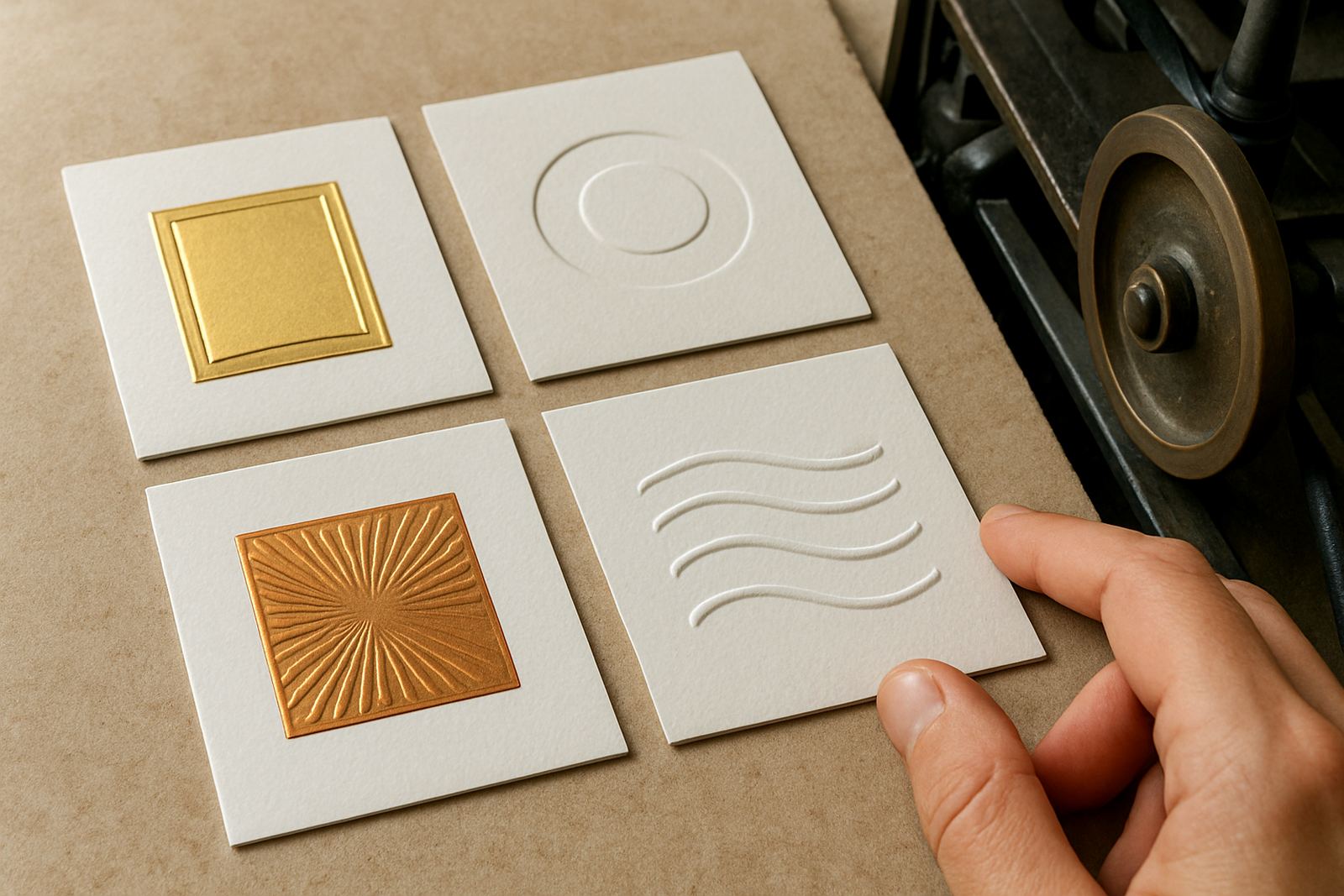
The top sheet of the board plays a big part in the final appearance. Clay coated boards, laminated boards, uncoated kraft, and textured stocks all react differently under heat and pressure. A smooth coated face usually gives a sharper foil image and a cleaner, more even shine. A rougher surface can leave tiny breaks in the coverage, especially on filled areas or fine reverses.
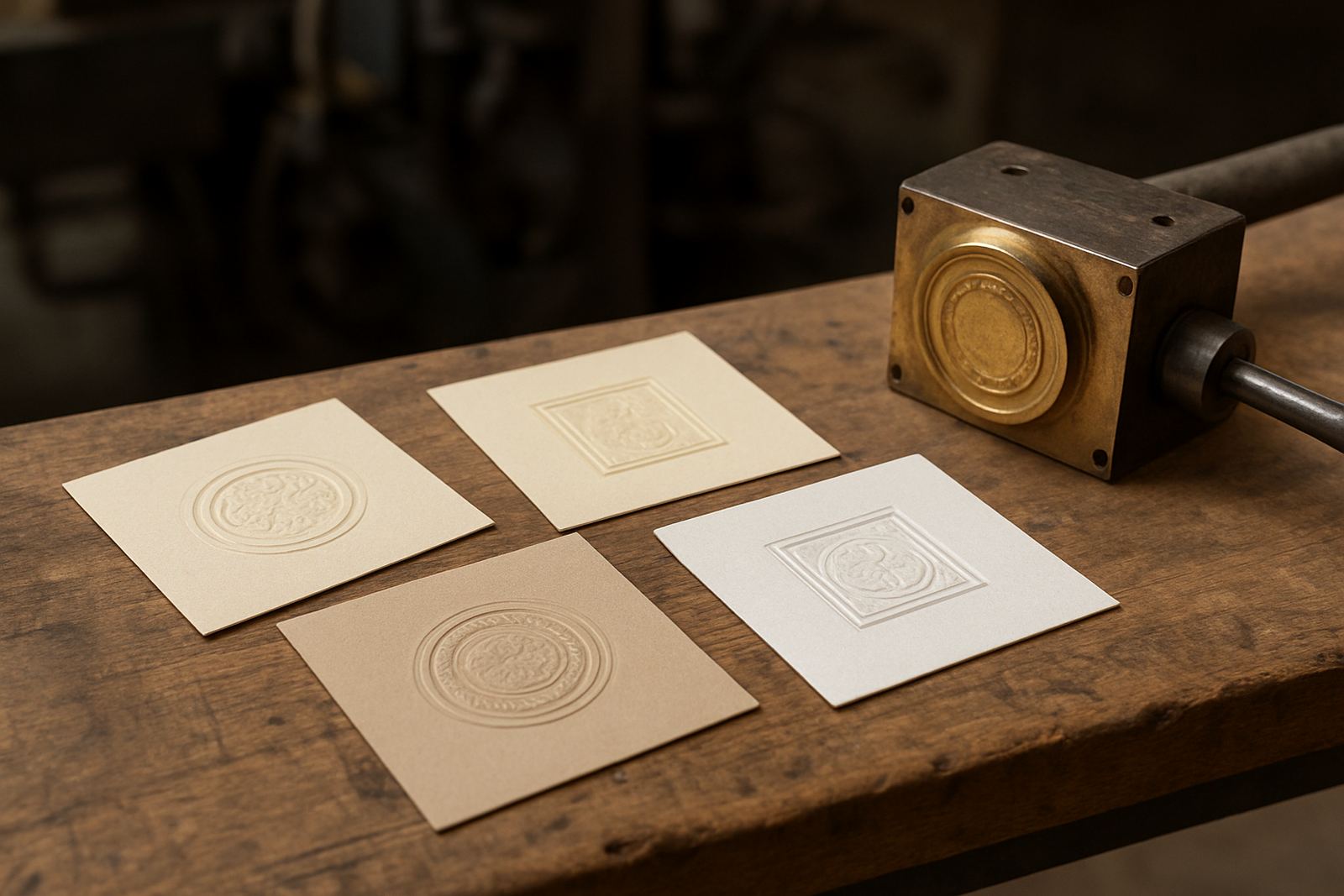
Texture also changes how the emboss reads to the eye. A strong linen or felt finish can soften the outline, while a smooth board makes the relief more obvious. That is not a fault, it is a material choice. The issue comes when the artwork was set up for a smooth sheet and then moved to a board with more tooth. The result can look duller than expected, even when the die itself is correct.
- Smooth coated boards suit fine foil detail and small reverse type
- Textured boards suit bolder embossing and simpler shapes
- Uncoated boards often need more careful pressure setting
- Laminate or varnish can change the grab of the foil and should be tested first
Fine detail needs a board that can hold shape
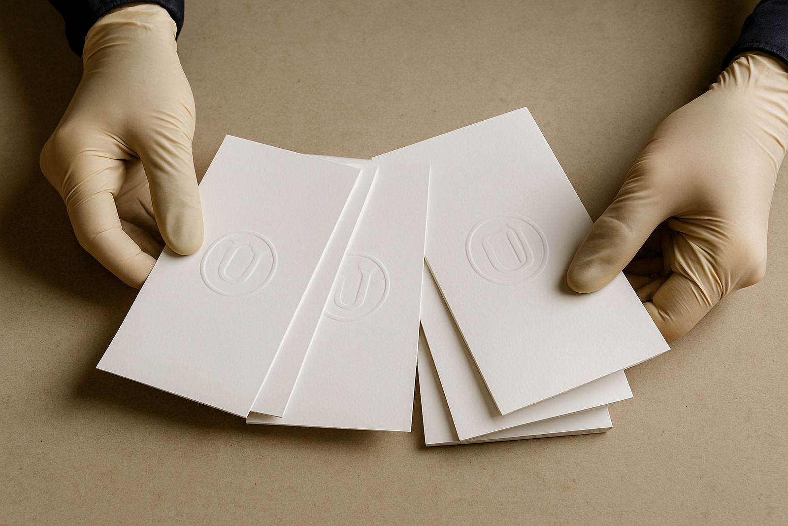
If the artwork has small lettering, thin lines, or sharp internal corners, the board has to support the image without springing back. Softer boards may accept the impression, then recover slightly after the press opens. That can close up hairline details or flatten a blind emboss. We see this often on packaging sleeves, wine labels, presentation covers, and short-run cartons where the client wants a premium feel but the substrate is light.
As a rule of thumb, the smaller the detail the more important the board caliper and fibre structure become. Heavy solid fills can work on a wider range of stocks, but fine line art is less forgiving. If the finish needs both foil and emboss in one pass, the board has to handle extra stress without cracking at the fold or around the image. It is better to pick the right stock than to try and force the result with more heat. That usually causes more trouble, not less.
- Small type needs firmer board support
- Deep embossing asks for stronger fibre formation
- Crease lines near the image must be planned early
- Overheating can cause a glossy foil patch or board marking
Folding cartons, sleeves and rigid boxes each need a different approach
Packaging is not one category. A folding carton for cosmetics, a greeting card sleeve, and a rigid presentation box all need different board choices and different die settings. A folding carton may need a lighter board that folds cleanly on the crease, while a rigid box cover can take a deeper emboss and a heavier foil block. The same die artwork may need adjustment depending on where the image sits near folds, flutes, or wrapped edges.
For print finishers in Johannesburg, Pretoria, Durban, Cape Town, Gqeberha, Bloemfontein, Polokwane, and Mbombela, the board also has to suit the local production flow. Some shops run the foil stage after laminating, others before. Some need a quick repeat order, others need a sample impression first. If the board changes from one batch to the next, the setting on press can shift and the result will not match the previous run. That is why repeat work should always be checked against the exact stock being used, not just the old job file.
Counterforce and die design must match the stock
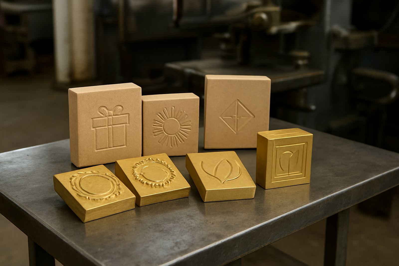
Good foil and emboss results are not only about heat. The counterforce beneath the sheet and the shape of the die have to suit the board thickness and surface. Too much counterforce can flatten the image and leave a hard line around the design. Too little and the impression looks weak or patchy. On thicker board, the die may need a different profile to bring out the detail cleanly, especially on larger coverage areas.
During artwork checks and die design, we look at line weight, image size, board caliper, and the way the job will be finished. That helps avoid costly do-overs. If the artwork has wide solid areas with small text inside, the pressure balance must be planned carefully. The same applies when embossing plates are paired with foil dies. A board that performs well for embossing alone may need a different set-up once foil is added.
Practical jobs often need a sample impression note before the full run. That saves time if the finisher needs to adjust the press setup or choose a different board grade. It is a small step, but it can prevent wasted stock and off-register sheets later on.
A Johannesburg example on a premium carton run
A packaging house in Industria was running a small batch of premium cartons for a client in the beauty sector. The first board choice was a softer coated sheet because it folded neatly and kept the print cost down. The foil looked acceptable on a quick proof, but the fine lettering lost crispness after the cartons were creased and assembled. On the second test we moved to a firmer board with a smoother face, and adjusted the die depth slightly. The foil edge came out cleaner and the emboss held its shape better after packing and courier handling.
That job also showed why local conditions matter. The cartons sat in a warm production area for part of the day, and the stock picked up a little moisture before finishing. Once the board moved, the pressure setting had to be corrected. It was a small change, but it made the final pack look proper. No fancy fix, just the right stock and a better match between board and die. That is often how good print finishing works in practice.
- Check the exact board before engraving starts
- Allow for humidity, storage time, and transport conditions
- Test foil and emboss together if both finishes are required
- Use sample impressions when moving to a new stock grade
What to send with the order so the finish matches first time
The fastest way to get a better result is to send complete job details from the start. That includes the board spec, sheet size, finish type, intended print process, and whether the job is going to a fold or a rigid assembly. If the client already has a sample or a previous run, that helps too. We can check for wear, damage, or a change in board grade before the new die is made. If the artwork needs a late tweak, it is far easier to change it early than after the press is booked.
For urgent turnarounds, clear information matters even more. A clean brief means less back and forth, fewer delays in dispatch, and a better chance of getting the die to the finisher on time. Good board choice does not just improve appearance, it keeps the whole line moving. When the stock and the die are matched properly, the job goes through cleaner and the finishing team spends less time fighting the sheet.
In hot-stamping and embossing, the board is part of the process, not an afterthought. Get that right and the finish shows it.