
Why uncoated stock reacts differently under pressure
Uncoated stock is absorbent, so it does not behave like a slick art board. The fibres open up, pull in moisture from the air and compress more readily under an embossing die or hot foil die. That gives a softer, more natural look, but it also means the same artwork can show different results from one paper lot to the next.
In Johannesburg winter, the dry air can make some sheets feel firmer and less forgiving, while in Durban the added humidity can swell fibres and slightly change how the stock accepts heat. For print finishers this matters because a die that looked perfect on one run may need a small pressure tweak on the next. We see this often with envelopes, carton sleeves, notebooks and premium marketing pieces where the paper has a tactile, matt finish.
How embossing depth changes on absorbent paper
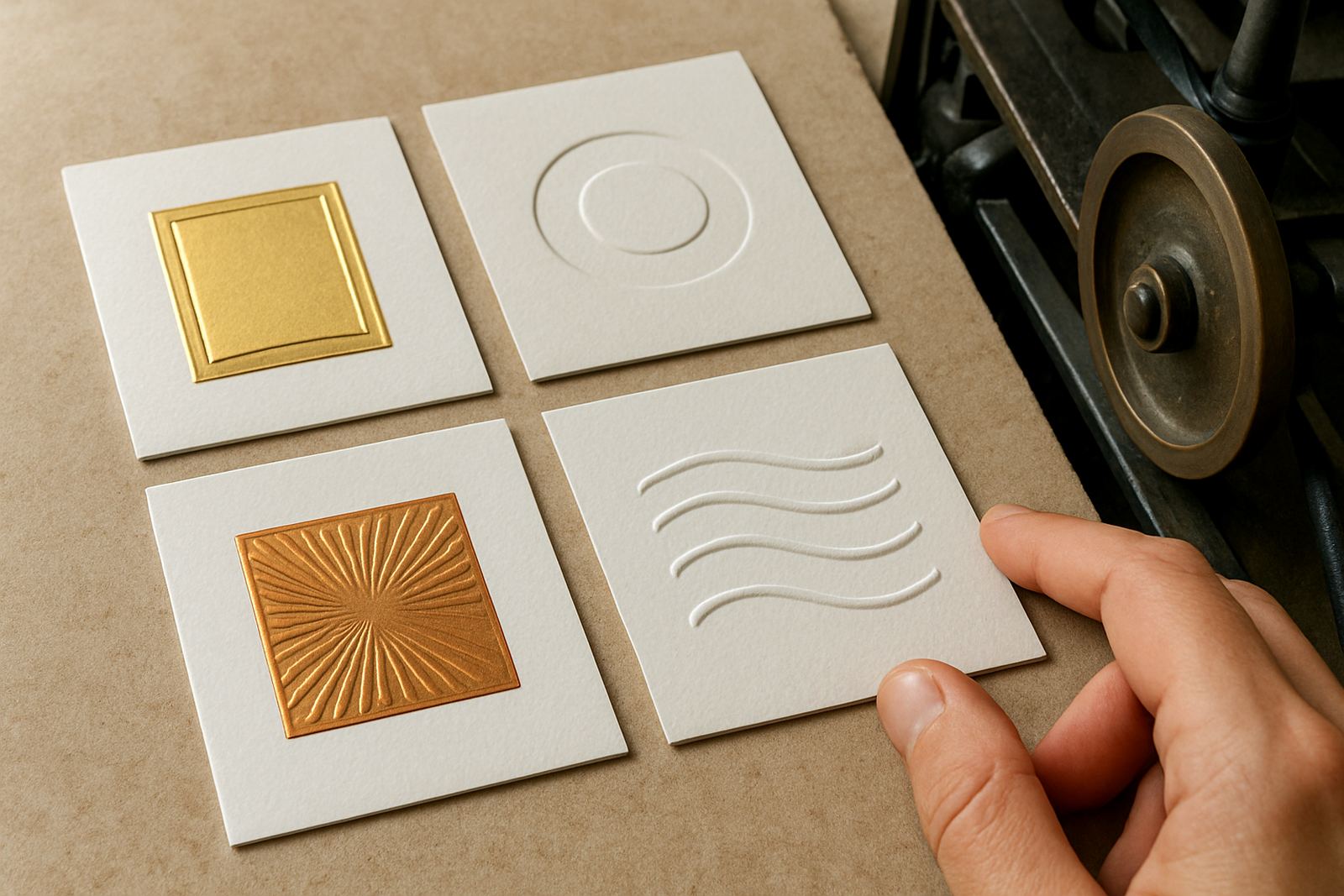
On uncoated materials, embossing usually reads a little deeper at the start, then settles as the fibres relax. A fine line can spread slightly, while broad fields may lose a touch of crisp edge. That does not mean the result is poor, it just means the die design and counterforce need to be matched to the stock rather than copied from a coated job.
For best results, keep the artwork honest. Very thin strokes, tight inside corners and tiny reverse detail can disappear if the board is too soft. A good rule is to allow more breathing room in the design and ask for sample impression advice before committing to a full production run. On heavier uncoated board, especially around 350 to 450 gsm, the impression can be very attractive when the die face and counterforce are properly set.
- Use slightly larger letterforms where possible
- Avoid hairline rules on soft textured stock
- Test both deep and shallow embossing before final approval
Foil transfer on porous fibre surfaces
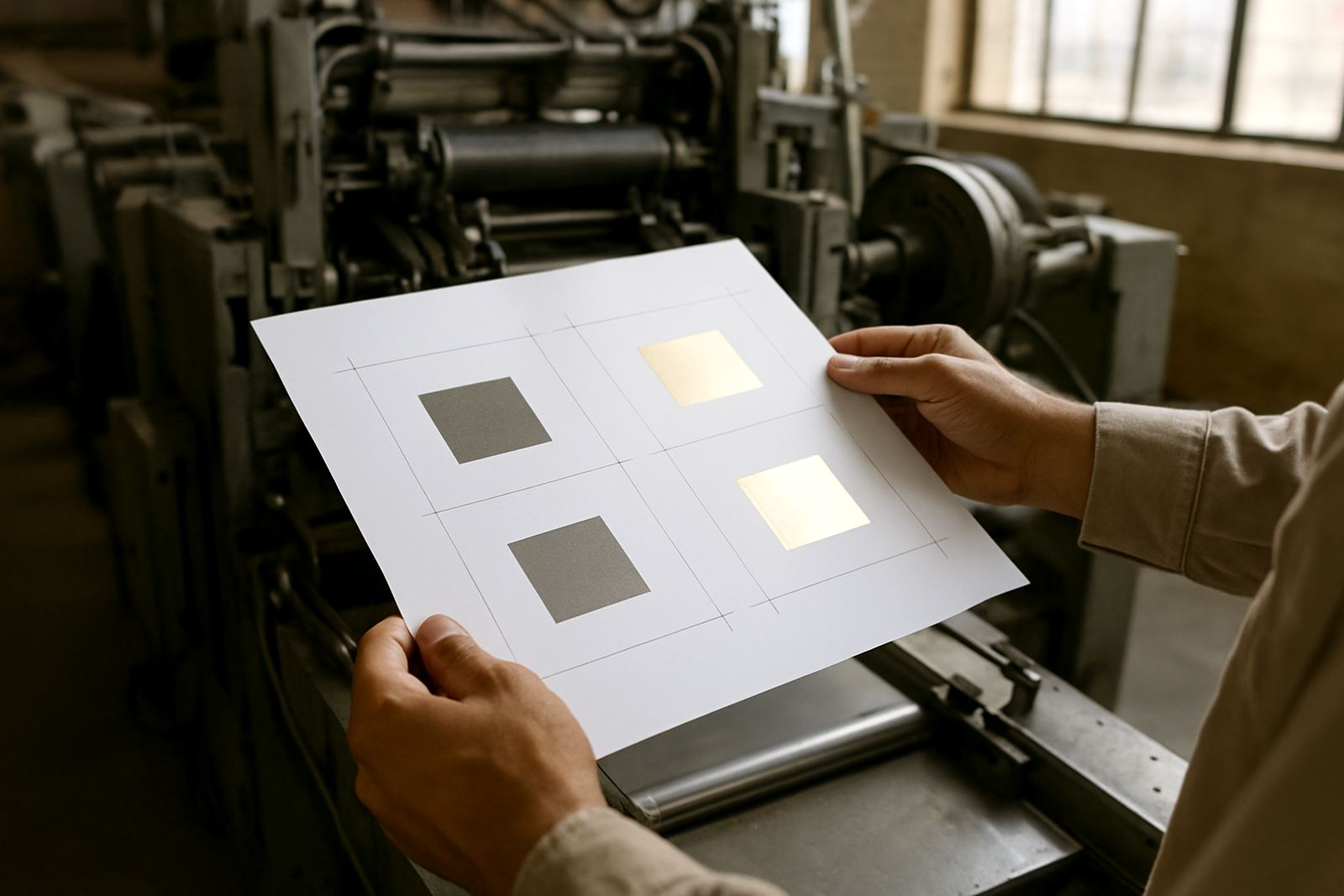
Foiling on uncoated stock can look elegant, but the surface demands careful control of heat and dwell time. The foil needs enough warmth to release cleanly, yet too much heat can scorch fibres or cause a dull halo around the image. Too little heat and you get weak transfer, patchy coverage or broken edges on fine detail.
Because the sheet drinks in some of the heat, the first few pulls may differ slightly from later sheets. That is why repeat ordering and job filing are useful. Keeping records of die type, pressure, foil grade and stock description saves time on reprints and helps avoid guesswork. If a client in Pretoria reorders a wedding suite six months later, the finishing team can start from proven settings instead of beginning again from scratch.
- Choose artwork with solid forms and clear spacing
- Expect softer shine on textured or fibrous papers
- Check for ghosting on heavy coverage areas
- Allow for a short make-ready period before final approval
Heat, humidity and load-shedding on the production floor
South African production rooms have their own conditions to manage. Load-shedding can interrupt machine temperature stability, and when power returns the die may need a little time to settle back to its working range. If the metal is not at a consistent temperature, foil release can become uneven from one pass to the next.
Humidity also affects the paper itself. Coastal clients in Cape Town, Gqeberha and Durban often see stock that curls or softens more quickly than inland stock. That means packing dispatch needs care too. Keep finished work flat, away from damp store rooms, and do not leave uncoated board open on the floor where it can pick up moisture. A clean, dry store room makes a noticeable difference, especially on longer runs.
What to check before approving the die and counterforce
Before a job goes live, the die should be checked against the final artwork and the counterforce matched to the exact stock build. A sample impression often tells you more than a proof on screen ever will. Look at the edges, the blind areas, and how the fibres recover after pressure. If the impression feels too soft, the issue may be counterforce or pressure rather than the die itself.
We normally advise clients to think about the finished pack, not just the image. Is the piece going into a folder, a rigid carton, or a mailer that may rub during transport? A die that works on a display sheet may not suit a folded carton with glue flaps or an embossed panel near a crease. Small layout changes can save waste later and keep the job cleaner overall.
- Confirm stock weight and fibre type before engraving
- Approve sample impressions on the actual board
- Check crease positions and glue zones
- Review whether the foil area sits close to trims or folds
A practical local example from Johannesburg to the coast
A common brief comes from a Johannesburg finisher producing branded cartons for a coastal retailer. Inland, the uncoated board may feel firm and hold a neat emboss quite easily. When the same pack is couriered to Cape Town or Durban, the humidity on arrival can change how the material reacts, so the team needs a little room for adjustment. That is why clear artwork checks and accurate die design matter before dispatch.
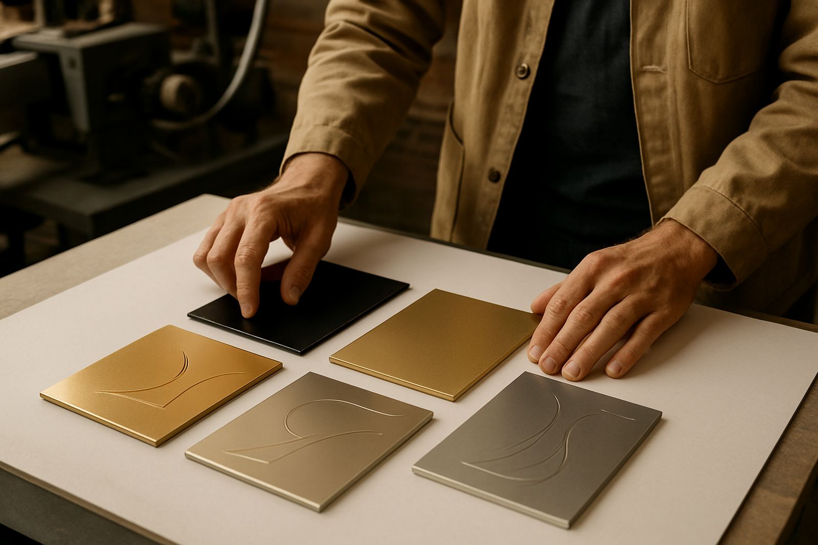
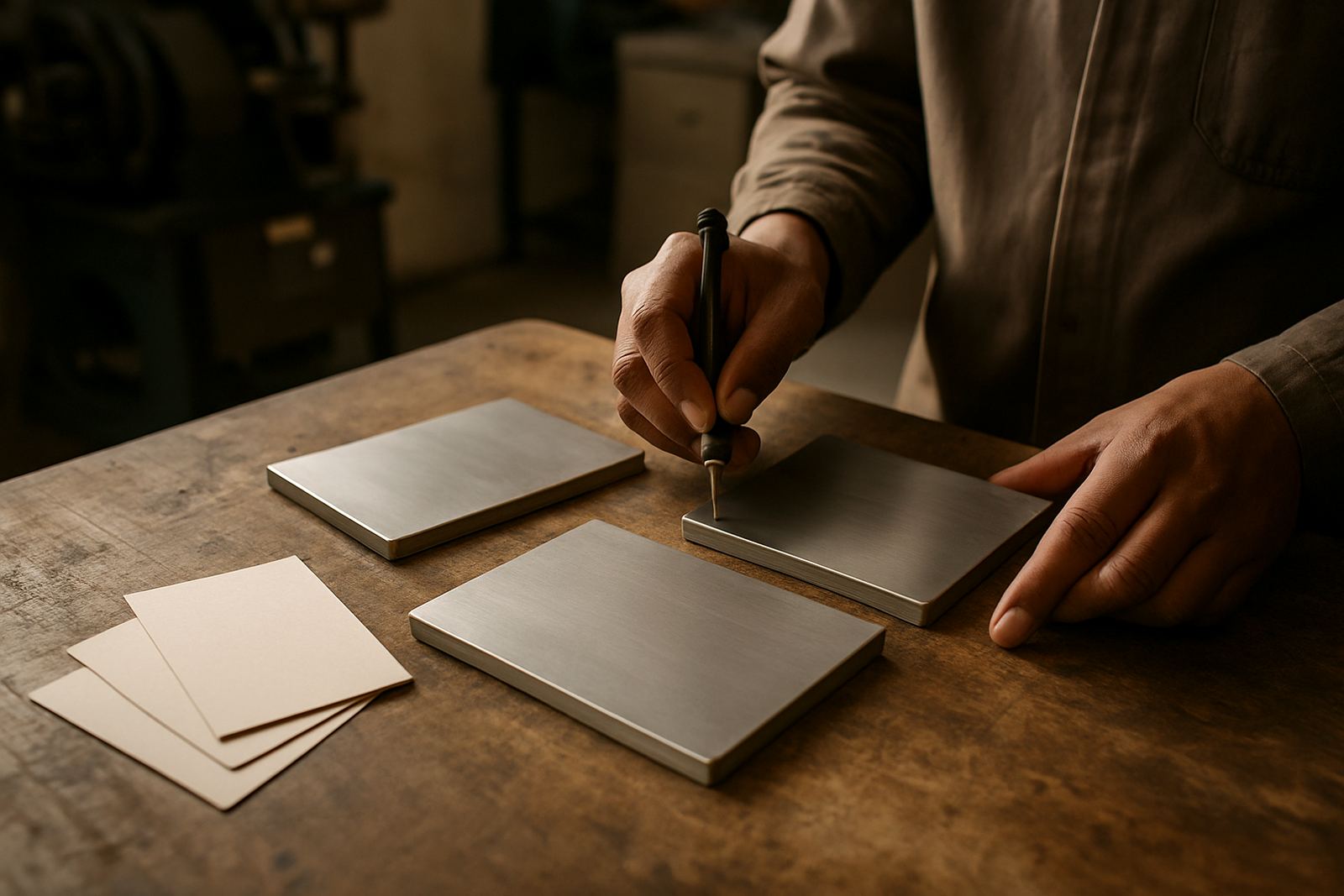
At our Industria base, we prepare brass and magnesium dies for offset, flexo and finishing teams that need precise results on absorbent stock. Thabo Mokoena and the team handle engraving production, sample impression advice and urgent turnaround requests when the schedule is tight. If the job is simple packaging, a premium invitation set, or a special carton with a blind emboss and foil mark, the key is the same: understand how the uncoated stock will behave before the press starts.
When that is done properly, uncoated paper gives a warm, tactile finish that feels considered rather than flashy. It suits South African brands that want a natural look with clear detail, especially where the customer will handle the piece closely and notice every small change in texture.