
What Debossing Actually Does to the Material
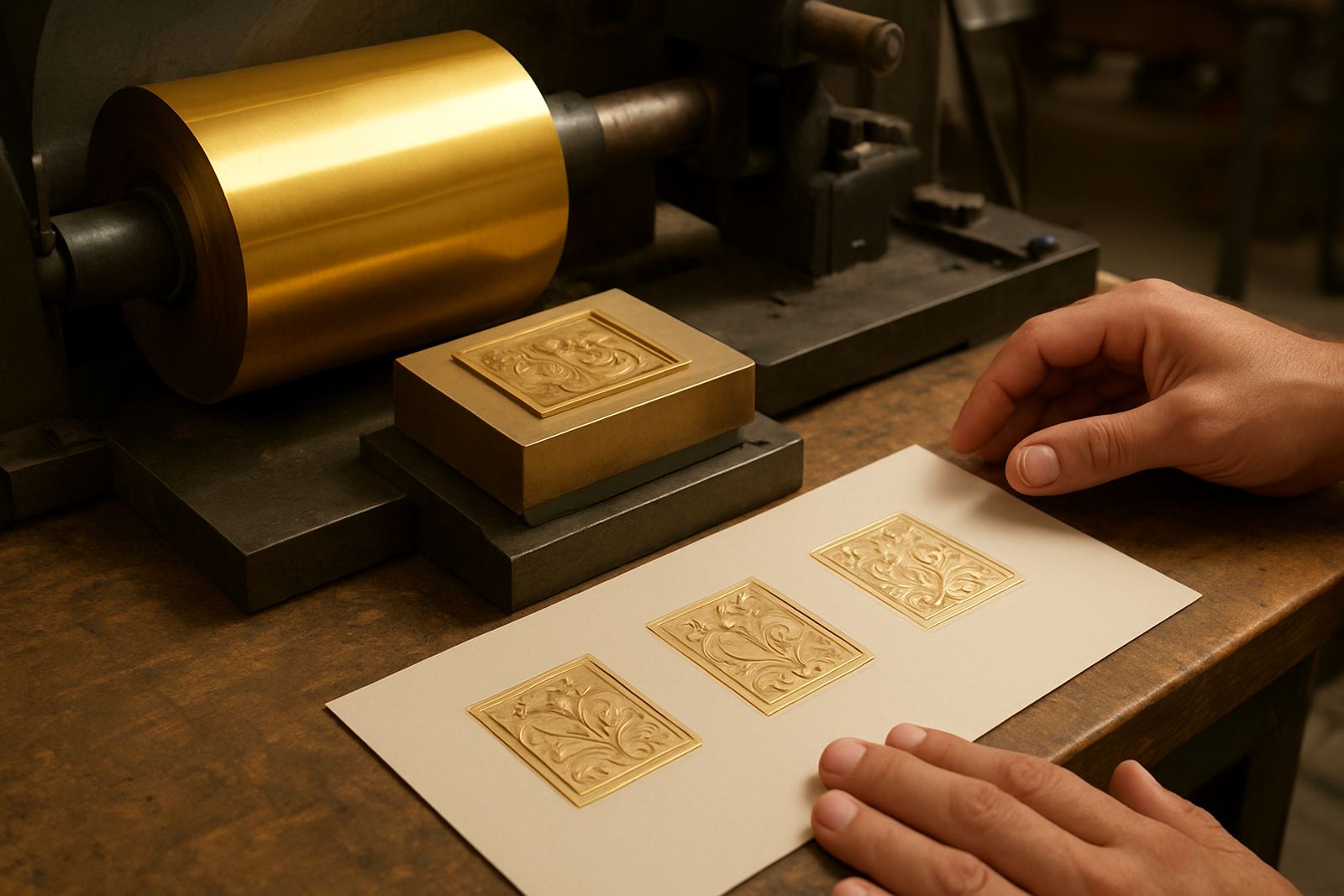
Debossing creates a recessed impression by pressing a heated or unheated die into the face of the sheet, pushing fibres downward instead of raising them up. The result is a tactile mark that feels neat and controlled, with the artwork sitting inside the stock rather than on top of it. On premium cartons, presentation folders, labels and invitation cards, that depth gives the piece a more considered finish.
The effect is often used on logos, borders, monograms and fine lettering. Unlike heavy print coverage, debossing relies on pressure, die detail and the way the substrate responds. If the material is too soft, the impression can spread. If it is too hard or too thin, the mark may be faint or uneven. That is why a proper artwork check and die setup matter before the job goes onto press or finishing equipment.
Where Debossing Works Best in South African Print Finishing
Debossing suits brands that want a cleaner, quieter finish. It is common on luxury packaging, presentation sleeves, stationery sets, corporate gifts and short-run retail cartons. In Johannesburg, Pretoria and Cape Town, print finishers often use it for product launches, wine packaging, cosmetics and boutique food labels where a flat print alone will not carry the same weight.
It also helps when the design needs to stay readable but not shout. A recessed mark gives presence without extra ink or foil. For municipalities, estates and corporate offices, debossed letterheads and folders can look more formal than a standard full-colour piece. On textured stocks, the impression can be quite subtle, so the paper selection has to match the brief not just the artwork.
- Best for thick paper, carton and selected board grades
- Useful for logos, initials, seal marks and small line work
- Works well on premium packaging where a restrained finish is preferred
- Needs enough sheet strength to hold the impression without cracking
How the Die, Counterforce and Artwork Must Work Together
A clean deboss depends on more than a good design file. The die has to be engraved to the right depth, the counterforce must support the back of the sheet and the job must allow for the pressure needed to create the impression. If any of these parts are out, you can get bruising, slur, weak edges or a mark that looks patchy across the sheet.
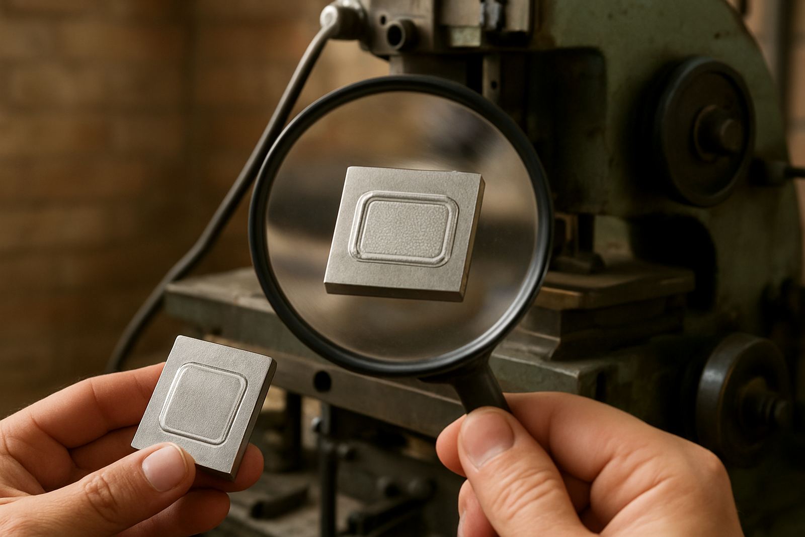
For this reason, artwork should arrive with clear line weights, proper spacing and accurate sizing. Fine strokes may need adjustment, while small lettering can close up once pressure is applied. A practical prepress check prevents waste and saves time later. In our experience, a file that looks fine on screen may need tiny changes before it becomes a sharp die. That step is worth it, especially on repeat work where consistency matters.
- Use clean vector artwork where possible
- Avoid overly fine detail in small formats
- Check reverse reading, orientation and registration points
- Match the counterforce to the stock and press setup
Choosing Brass or Magnesium for a Debossing Job
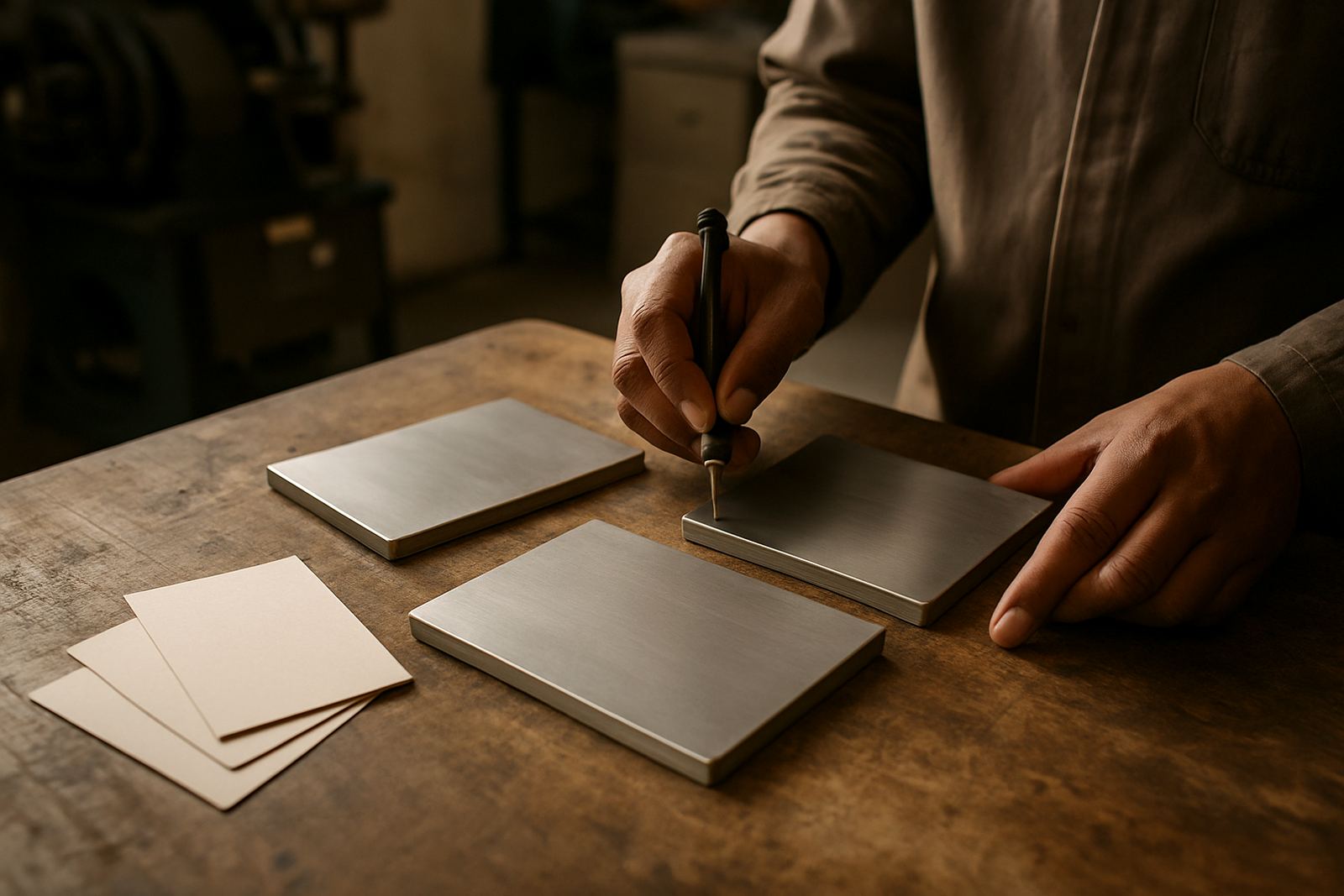
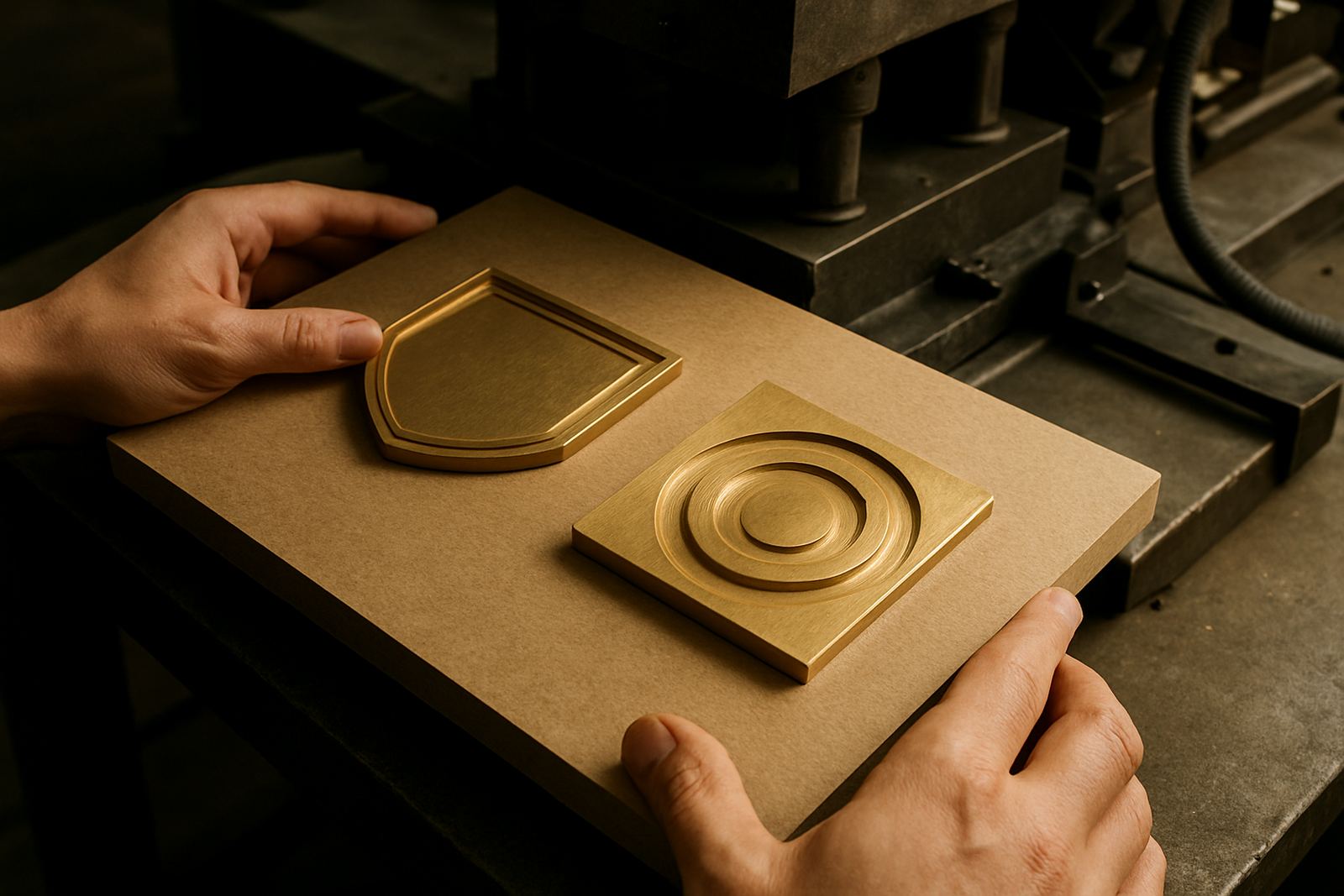
Different jobs call for different die materials. Brass is suited to detailed work, longer runs and jobs where fine edge definition is important. It holds detail well and is often chosen for packaging and finishing work that needs a precise, durable die. Magnesium can be a practical option where the run is lighter or turnaround is tighter, especially for simpler artwork and shorter production schedules.
In both cases, the finish depends on careful engraving and proper handling. If a die is chipped, dirty or stored badly, the impression quality will suffer. That is why repeat ordering, job filing and die cleaning are important parts of the process. A well-kept die gives better consistency on the next run and avoids delays when the same client needs another batch in a hurry.
When Debossing Should Be Kept Light, or Skipped Altogether
Not every substrate can take a deep recessed mark. Very thin paper, heavily coated stocks, fragile recycled board and moisture-sensitive material can behave badly under pressure. In coastal areas such as Durban and Gqeberha, humidity can affect stock stability, so handling and packing matter before the job even reaches the finisher. A heavy deboss on the wrong sheet may crack the face, distort the edges or show through on the reverse.
There are also design limits. If the artwork is too close to a fold, trim line or glue area, the impression can interfere with assembly. For cartons and folded pieces, sample impression advice helps avoid costly rework. When a project needs a stronger branded effect, some clients will pair debossing with foil or print, but the impression itself should still be planned carefully so it supports the layout rather than fighting it.
- Leave enough margin around folds and trim lines
- Test unusual stocks before full production
- Keep deep impressions away from glue areas
- Allow for humidity changes during storage and dispatch
A Practical Johannesburg Example
A print finisher in Industria may receive a rush order for premium cartons going to Sandton, with the client wanting a subtle debossed logo on the lid. The artwork is checked, the die size confirmed and the counterforce matched to the selected board. Because the board is thick enough and the logo has clean spacing, the first sample impression comes back sharp without over-pressing the sheet.
From there, the die is packed for dispatch and couriered out with clear job notes so the finisher can set up without guesswork. That kind of coordination saves time, especially when delivery must reach a packaging house in Pretoria or a finisher in Durban before the end of the week. If the job is filed properly, the same die can be repeated later with less setup time and fewer surprises.
Why Debossing Still Has a Place in Premium Branding
Debossing works because it is physical. It does not rely on colour alone to carry the message. Instead, it uses depth, shadow and touch to give the design a quieter kind of authority. That suits brands that want packaging or print collateral to feel considered rather than crowded. It also holds up well in busy retail settings where a tactile mark can set the product apart without making the layout look loud.
For South African businesses, the value is practical as well as visual. The right die, proper artwork setup and accurate packing can keep the process predictable across repeat runs, whether the job is headed to Cape Town, Bloemfontein or Polokwane. When the impression is right, the finish speaks for itself, and the brand looks like it paid attention to the small details. That is often what clients remember most.