
Why small lettering fails more often than expected
Small text puts pressure on every part of the job. The strokes are thinner, the counters are tighter and any movement in the press shows up straight away. In hot stamping and embossing, a line that looks crisp in artwork can fill in once heat, pressure and foil are added. That is where copy starts to lose letters, join together or simply disappear on the finished pack.
The risk is not the same on every substrate. Coated board, textured board, laminated stock and soft-touch finishes all react differently. A smooth carton may hold a 5 pt line, while a rougher material can close the gaps and make a word unreadable. On a busy label or carton face, the eye also needs breathing room. If there is no space around the wording, even a good die will struggle to hold definition.
In Johannesburg, we often see this on fine print for prestige packaging where the brand wants a lot of information in a small area. It may look smart in the proof but once it gets to the finisher, the tiny line work is giving problems. A quick check upfront saves rework, and a lot of frustration too.
What happens to tiny text on press and foil
When lettering gets very small, a few common faults appear. The first is fill-in, where heat and foil close up the spaces inside letters like a, e, o and r. The second is weak impression, where the die does not carry the stroke cleanly across the whole word. The third is distortion, where pressure or uneven packing makes one side of the text heavier than the other.
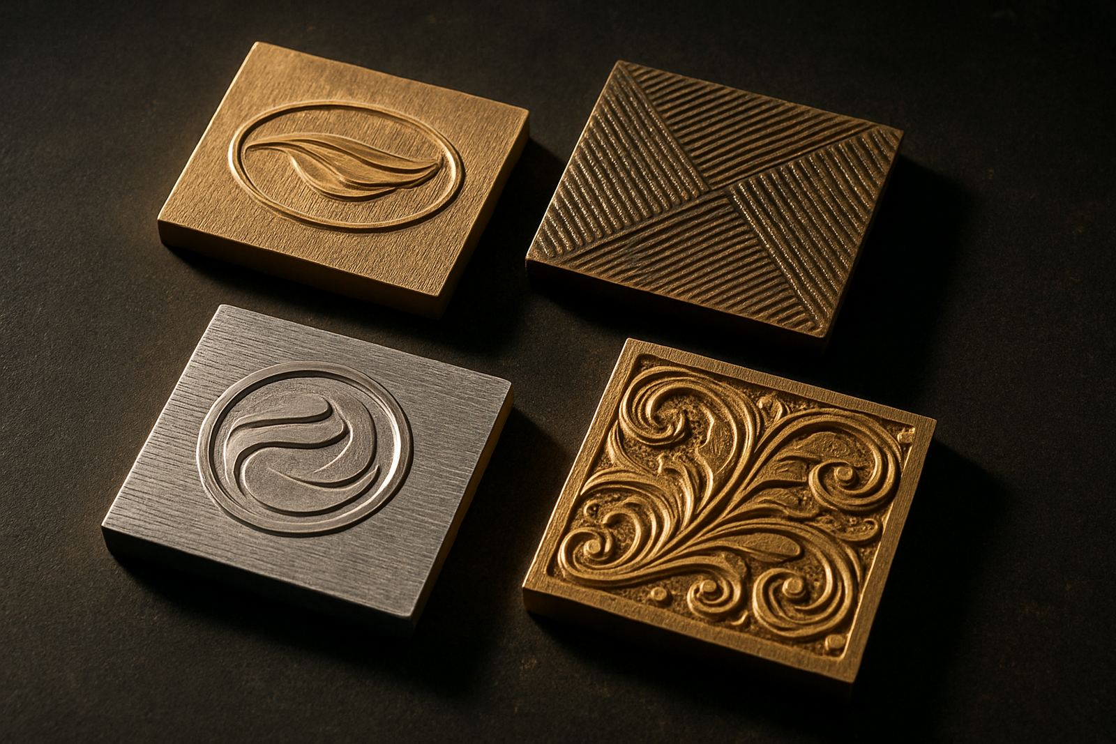
Magnesium and brass each behave differently, and the job must suit the application. For repeated production or more detailed work, the engraving quality and the die finish matter just as much as the artwork itself. If the line is too fine, or the counters are too tight, the best setup in the world will still struggle. You cannot rescue a risky line once it is cut.
- Very fine serif fonts often lose detail first.
- Knockout text over solid areas can fill in quickly.
- Long words in small caps may crowd together.
- Close tracking can cause letters to merge on the foil.
- Thin strokes on textured board can vanish after stamping.
Artwork choices that improve readability
Good small text starts in the artwork. The cleanest jobs usually use simple letterforms with enough weight to survive the press. Straightforward sans serif type is often safer than decorative faces, especially where the wording must remain readable at a distance. You also need enough contrast between the letters and the surrounding area, plus space above and below the line.
Before production, the artwork should be checked for line thickness, spacing and reversal issues. If a logo or note sits too close to a fold, edge or emboss area, it may distort once the board is cut and creased. We also look at whether the text will be foiled, debossed or embossed, because each finish changes what the eye reads and what the die can hold.
- Keep small text away from folds, curves and heavy texture.
- Use open letterspacing rather than crowding words together.
- Avoid ultra thin fonts for legal lines, batch notes or product descriptors.
- Test reversed-out copy carefully before committing to the die.
The material matters as much as the font
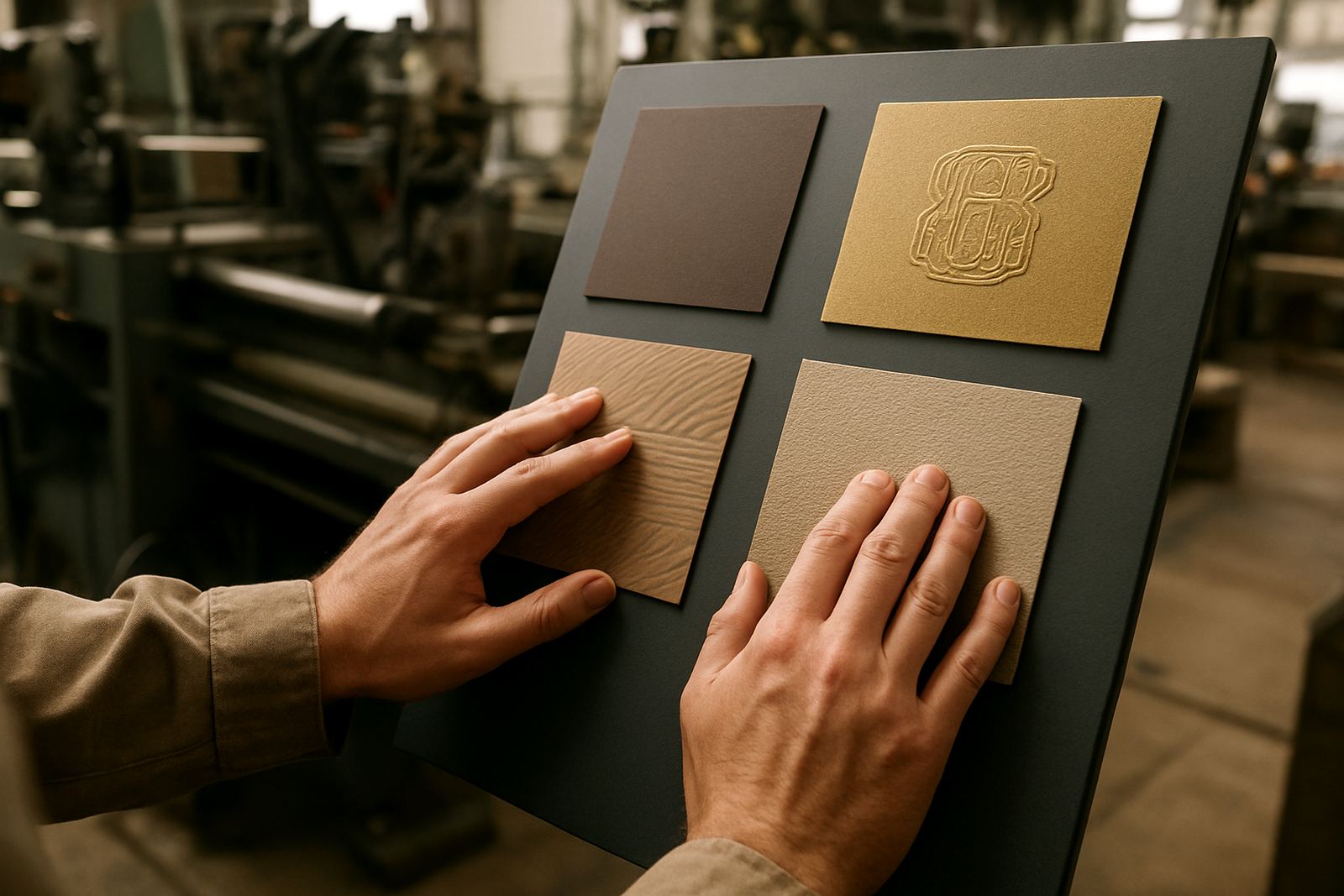
Some boards and papers take detail neatly, while others fight it. A smooth coated carton usually gives better definition than a rough kraft surface. Soft-touch lamination can look premium, but it can also increase drag and reduce clarity if the text is too fine. On some packs, foil sits well, but on others the same line looks patchy or broken because the surface is simply not giving the die enough support.
Humidity plays a part too, especially in coastal towns like Durban or Gqeberha. Stock can move with the weather, which changes how the impression behaves. In winter dry conditions or in a hot packing room, the material can also tighten up or soften, and that shifts the final result. This is why a sample impression is worth the time. It shows how the line will read on the actual material not just on a proof sheet.
For packaging houses sending work nationwide, the safest route is to match the text size to the substrate at the start. A die that is well matched to the material will save time on press and reduce repeat issues later on.
How to set a safer minimum for your job
There is no single minimum size that suits every job, but there are practical rules. If the message must be read by hand at close range, it needs enough width in the strokes and enough separation between characters. If the wording is technical, legal or date-related, treat it as critical copy and give it extra attention. The smaller it gets, the more important the counterforce, packing and mounting become.
It also helps to think beyond the die alone. A good job depends on the full setup from artwork to dispatch. The plate or die must be clean, properly filed and matched to the press conditions. If the job is a repeat order, use the previous file and check whether the stock or finish has changed since last time. Even a small change in board can shift the result, so a repeat is not always a straight copy.
- Allow extra margin around tiny wording.
- Keep critical text on flat areas where possible.
- Use a sample impression before full production.
- Ask for damage assessment if a die has been dropped or dented.
- Store repeat files clearly so the next run is quicker and cleaner.
A Johannesburg example and the practical fix
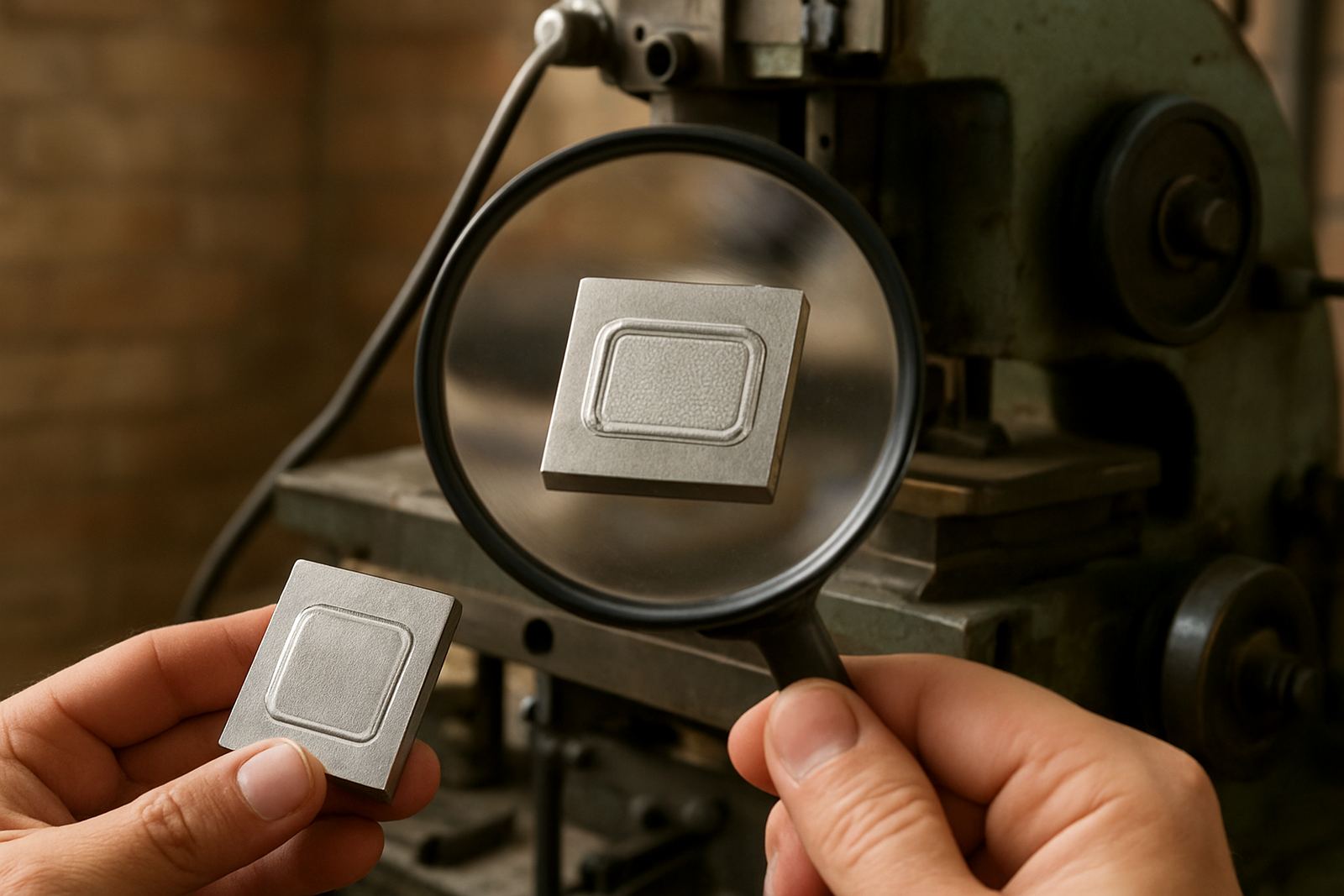
A print finisher in Industria recently brought in a carton job for a premium insert pack. The main logo was fine, but the small line under it was disappearing after stamping. The issue was not the press alone. The text was too tight, the line weight was too thin and the stock had a light texture that was closing the counters. The first sample looked tidy enough from a distance, but under close inspection the wording was starting to blur.
We checked the artwork, widened the spacing slightly and adjusted the die design for better definition. The team also reviewed the counterforce to suit the stock, and the second sample held the lettering far better. That saved the client from a messy run and kept the pack readable. In jobs like this, the fix is usually a mix of better artwork decisions, careful engraving and honest sample advice, not one single trick.
If you are working on packaging for Pretoria, Durban, Cape Town or anywhere else in South Africa, the same principle applies. Tiny lettering needs planning. When it is treated as a production issue instead of just a design detail, the result is cleaner and the job runs more smoothly.