
What a deep emboss can and cannot do
A deep emboss is not just a deeper impression. It changes how the fibre in the sheet moves, how the counterforce supports the reverse side, and how much pressure the press must deliver. On coated stock or stiff carton, the material may hold the shape well, but once the depth pushes too far the surface can split or the detail can flatten instead of sharpening.
In practical terms, the limit is not set by one number only. It depends on the paper or board, grain direction, moisture content, artwork size, and whether the design has fine lines or large solid areas. A small logo with clean edges can often take more depth than a wide panel with tight corners. That is why we look at the full job before quoting a deep emboss limit.
Paper stock and board weight shape the outcome
Thicker board does not automatically mean a deeper result. A 400 gsm board with short fibres may crush sooner than a well-made 300 gsm sheet with better formation. Texture also matters. Laid finishes, uncoated boards, and some recycled stocks can all behave differently under pressure. In humid coastal conditions, sheets can gain a bit of moisture and lose firmness, so a job that worked in winter in Pretoria may need adjustment when it is run in Durban.
Before we approve a deep emboss, we usually check the following points:
- Sheet weight and caliper
- Grain direction and fold positions
- Coating type and surface slip
- Artwork line thickness and open areas
- Whether the reverse side must stay clean for print or lamination
If the stock is too soft, a lower relief with sharper definition often looks better than chasing extra depth. That saves time and reduces spoilage, especially when the job is running on a tight pack schedule.
Die depth, counterforce, and press pressure must work together
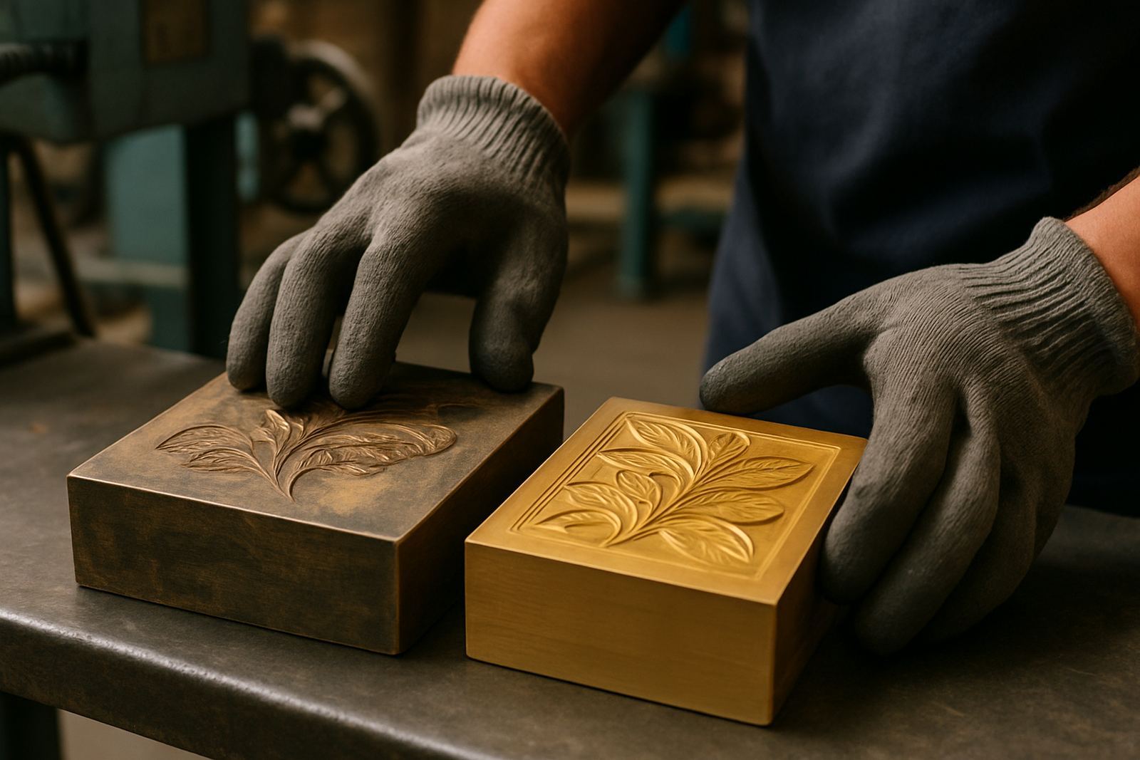
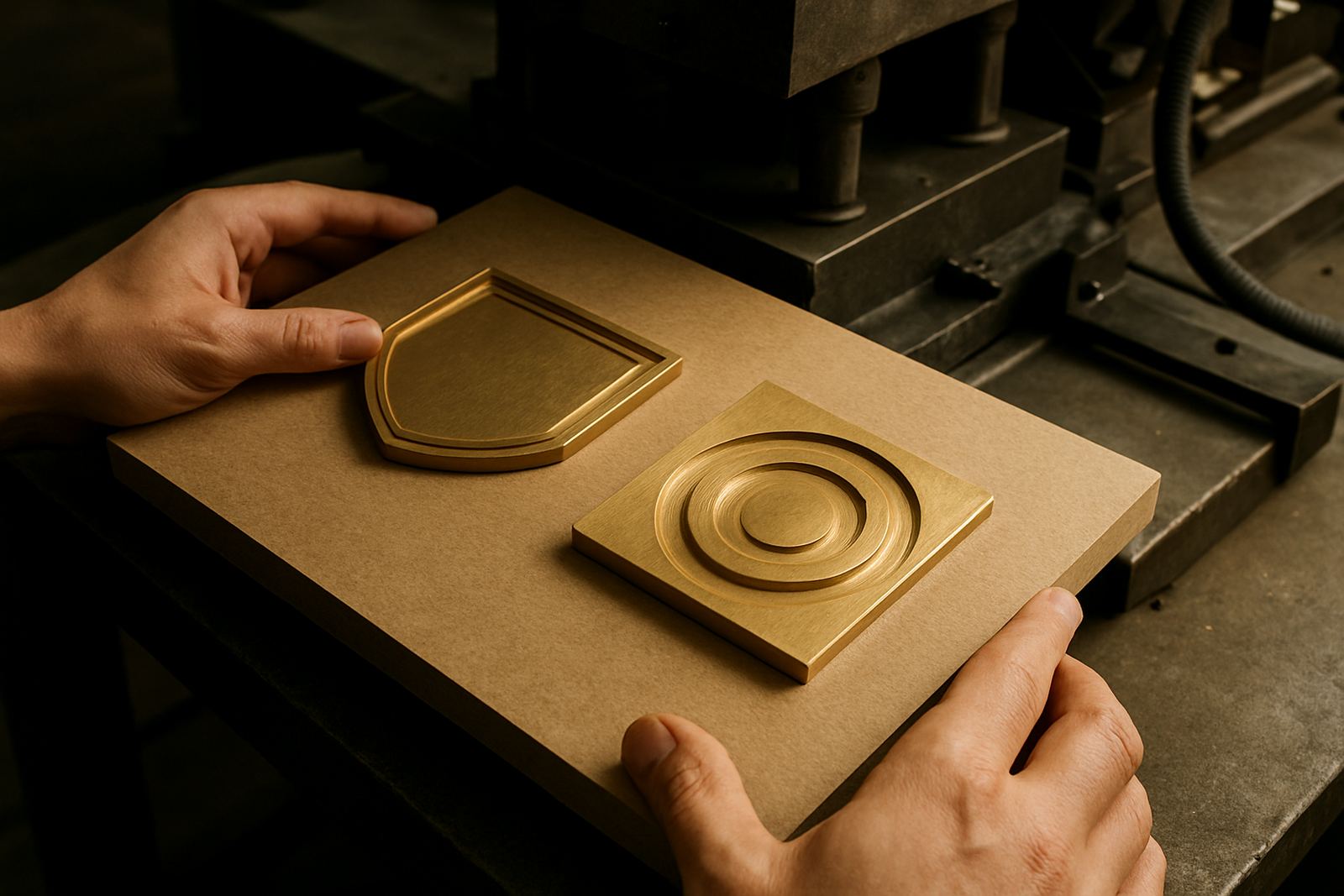
Deep embossing needs the die, the counterforce and the press to be matched as one set. A brass die can carry finer detail and hold up well on long runs, while a magnesium die is often chosen for lighter duty or quicker turnaround work. The problem starts when the requested depth is beyond what the press and counterforce can support cleanly. Then the image may look muddy, or the shoulders of the emboss may collapse after the first few sheets.
We also factor in the size of the area being stamped. A small crest can handle a deeper profile than a full-panel emboss because the pressure is more concentrated. With larger artwork, we may recommend stepped depth, a wider relief, or a stronger counterforce build-up. The goal is not just to make it deeper, it is to make it repeatable and clean across the full run.
Common warning signs include:
- Paper cracking at the high point
- Flattened edges around fine detail
- Weak definition on the outer corners
- Reverse-side marking where there should be none
Artwork choices that limit excessive depth
Some artwork suits a deep emboss and some simply does not. Thin serif lettering, tiny hairlines, and closely spaced elements can lose definition once the impression gets too heavy. Large open spaces are also tricky because the sheet can stretch unevenly and leave a hollow look. If the design includes a border, the corners need extra care. Sharp internal corners are often the first point to split.
When clients ask for more impact, we usually suggest adjusting the artwork before pushing depth. That may mean widening key lines, opening up close spacing, or separating a logo from a background panel. A few small changes can improve the result more than another 0,2 mm of depth. It also makes repeat ordering easier later on.
Useful artwork adjustments often include:
- Thickening very fine strokes
- Removing tight inside corners
- Increasing space between letters
- Breaking large solid areas into smaller zones
Why sample impressions save money on difficult jobs
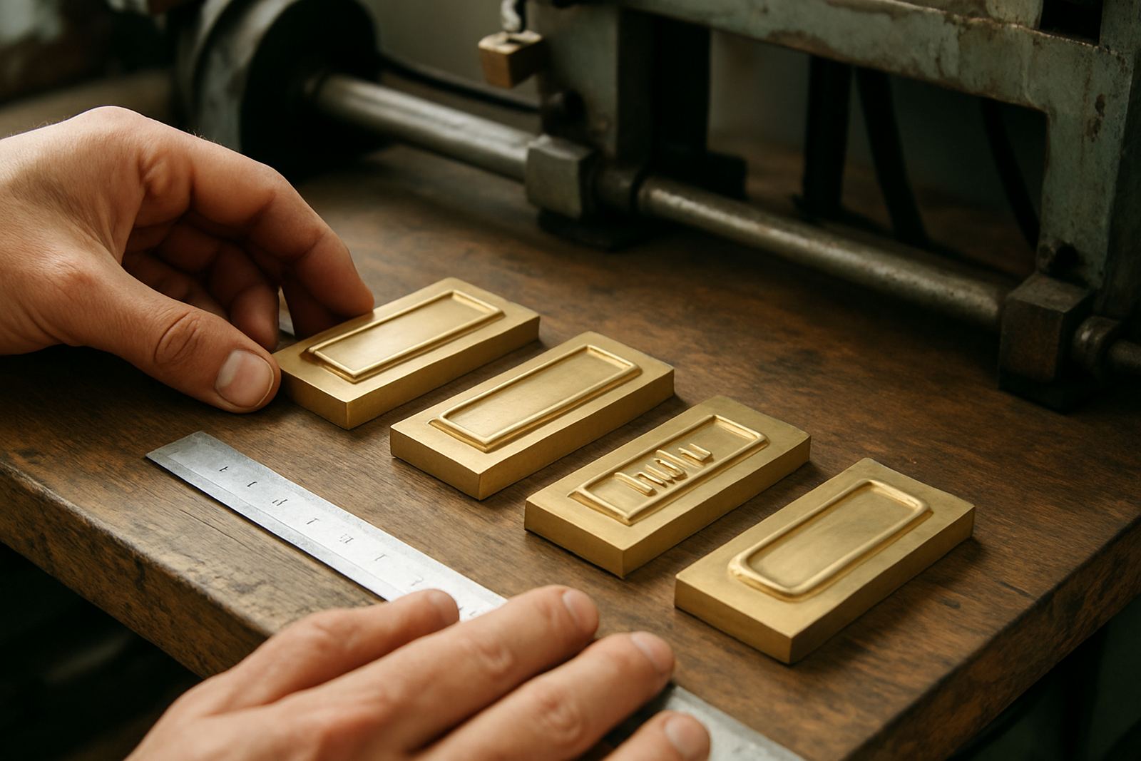
For deep emboss work, a sample impression is often the best warning you can get before a full production run. It shows whether the stock can take the pressure, whether the counterforce is holding, and whether the impression is too aggressive for the finished pack. On a difficult carton, the first sample might reveal that the artwork needs a shallower profile or a stronger backing board. That is a lot cheaper than finding out after 5,000 sheets have been pulled.
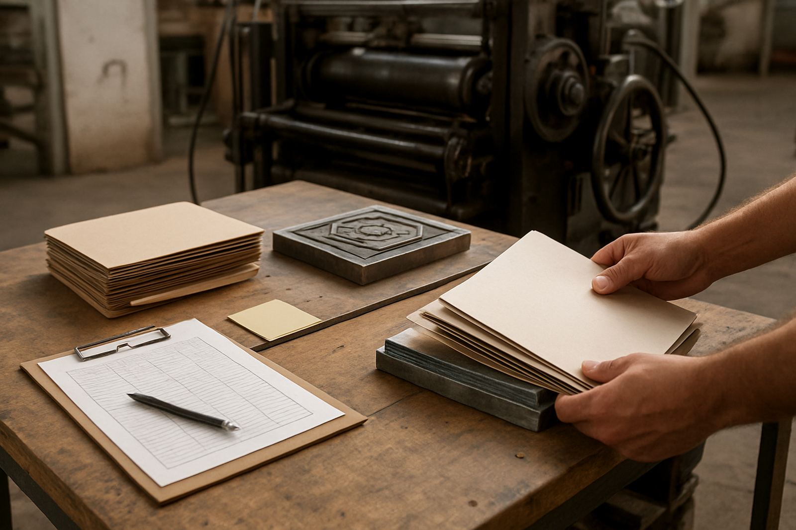
We also use sample impressions to judge whether the job can be safely repeated after transport or storage. In Johannesburg, a sheet may behave one way in our workshop and another way after it has been couriered to a finisher in Cape Town or Gqeberha, especially if the stock sat in a hot warehouse. That is why we keep job notes and filing in order, so repeat orders can be checked against the original settings instead of starting from scratch.
When to choose a shallower finish instead
Sometimes the best answer is not a deeper emboss but a better balanced finish. A slightly shallower impression with crisp edges can look more premium than a heavy emboss that has pushed the sheet past its limit. This is common on uncoated craft boards, recycled packaging, and work that must pass through gluing or folding stages after finishing. If the reverse side will show through the pack, or if the carton has to stay flat in a display tray, depth needs to be handled carefully.
We often advise a shallower finish when the job needs any of the following:
- Fast repeated production with limited setup time
- Printing on stock with variable fibre structure
- Jobs exposed to humidity during inland to coastal couriering
- Packaging that must still fold cleanly after finishing
The practical answer is usually the one that protects the run, not the one that looks biggest on the test sheet. A tidy impression, properly matched to the stock, holds up better in real use.
A Johannesburg example from brief to dispatch
A packaging house in Industria recently needed a deep embossed mark for a premium carton heading to retail stores in Durban and Bloemfontein. The first brief asked for a very high relief on a coated 350 gsm board. After checking the artwork and doing a sample impression, it became clear that the outer letterforms were too thin for the requested depth. We widened the strokes, reduced the depth slightly, and adjusted the counterforce so the reverse side stayed clean.
The final result had stronger definition and no cracking on the fold line. Because the files were filed properly and the die details were recorded, the repeat order could be processed quickly when the client needed more stock a few weeks later. That kind of planning matters when a job has to move by courier across provinces and still arrive ready for the press.
Deep emboss limits are not about saying no. They are about getting the finish to work in the real world, where paper stock, pressure, weather and deadlines all count.