
Why foil colour behaves differently on every substrate
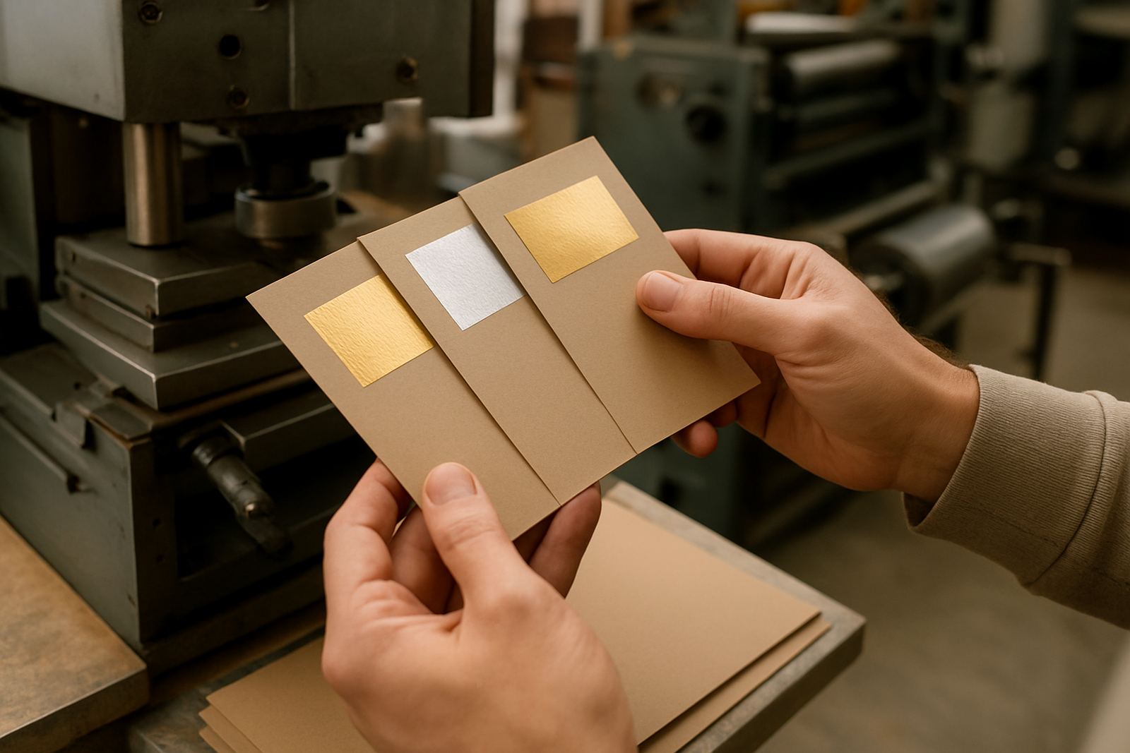
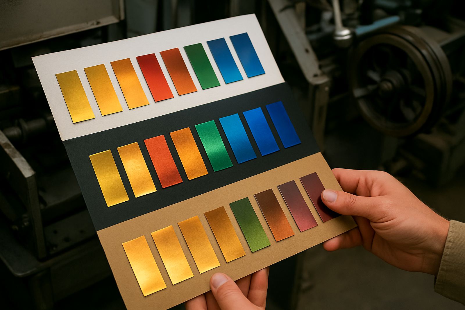
A metallic or pigment foil can look bright on one stock and muted on another, even when the same die and press settings are used. The reason is simple: the substrate tone, absorbency and surface finish all affect how the transferred colour sits on top of the material. On a white coated board, for example, a gold foil may read clean and sharp. On a kraft board, the same foil can look warmer, darker and less reflective.
This matters for packaging, cartons, presentation folders and labels where colour consistency is part of the brand. A client in Johannesburg may approve a sample on smooth coated board, then be disappointed when the same artwork goes onto a textured stock for a short run. That is why foil colour planning should happen before the die is engraved, not after the first press pull.
Match the foil to the substrate tone, not just the artwork
The artwork might ask for silver, copper or a deep red foil, but the substrate decides how that colour is perceived. Light, neutral boards generally keep foils closer to their expected appearance. Dark boards can alter the balance and make pale foils look duller. Textured or uncoated stocks also soften the shine, which can be useful if you want a more restrained finish.
- White coated board: best for crisp metallic contrast
- Kraft and natural board: gives foils a warmer, earthier look
- Dark board: strong contrast is needed or the foil can disappear
- Textured stock: fine detail may need a bolder line width
If your design relies on very small text, fine linework or detailed crests, test the substrate early. What looks neat on screen can lose clarity once the foil transfers onto an absorbent or heavily textured surface.
Gloss, matte and soft-touch finishes change the final look
Surface finish can matter as much as colour. A gloss laminated carton will reflect more light and make foil appear brighter. Matte stock tends to calm the effect and can make metallic foils feel more refined. Soft-touch coatings can flatten the surface even further, which is useful for premium cosmetics, wine packaging and corporate presentation pieces, but it may reduce the sparkle of bright foils.
When planning a job, think about the full pack or printed item, not only the foil area. A gold foil on a matte black carton can look very different from the same foil on a gloss black carton. If the pack also carries varnish, embossing or print, those layers all influence how the foiled area is read from a distance and in hand.
Use contrast to control legibility and premium feel
Foil is often used for impact, but impact only works when the contrast is right. Light foil on light stock can wash out. Dark foil on dark stock can disappear. The most reliable results usually come from pairing the foil tone with enough substrate contrast so the logo or wording stays readable under shop lighting, office lighting and daylight.
A packaging house in Durban dealing with humid conditions may also need to think about how the chosen stock behaves after storage and transport. Coastal moisture can change board feel and make some surfaces less predictable. If the item will be couriered nationwide, it should still print and register properly when it reaches the finisher in Cape Town, Polokwane or Gqeberha.
- Choose stronger contrast for small text and line detail
- Use softer contrast when the aim is a subtle premium look
- Test daylight and indoor lighting before approving the job
- Allow for moisture and storage differences between regions
Embossing adds another layer to foil colour planning
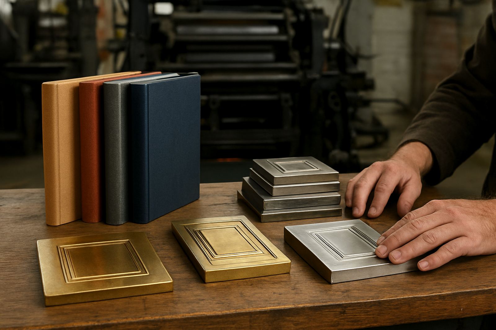
Once embossing enters the job, the substrate choice becomes even more important. A deep emboss on a soft stock can create shadow that changes the appearance of the foil across the raised area. On rigid board, the same effect can look sharper and more defined. If the die and counterforce are not matched properly, the foil may break on the high points or lose detail in the low points.
For foiled crests, labels and luxury packaging, we usually recommend checking the impression depth against the substrate before full production. That helps avoid cracking, uneven pressure or a patchy finish. It also allows for sensible adjustments if the job needs to be repeated later, since repeat ordering should match the original sample as closely as possible.
A practical Johannesburg example for packaging and print finishing
Imagine a Johannesburg client in Industria preparing a limited run of carton sleeves for a premium gift set. The brand wants a copper foil logo, but the first stock choice is a warm kraft board. The result will be earthy and honest, which may suit some products. If the aim is a more polished retail look, however, the same foil on a cream coated board could give stronger separation and a brighter result.
Now add an embossed border and a matte laminate. The finish becomes calmer and more controlled, while the foil remains the focal point. If the artwork is small or the logo has thin strokes, a small change in substrate tone can make the difference between a clean impression and one that looks crowded. This is why a sample impression is worth the time, even when the schedule is tight and the job needs urgent turnaround.
How to brief foil colour properly before engraving starts
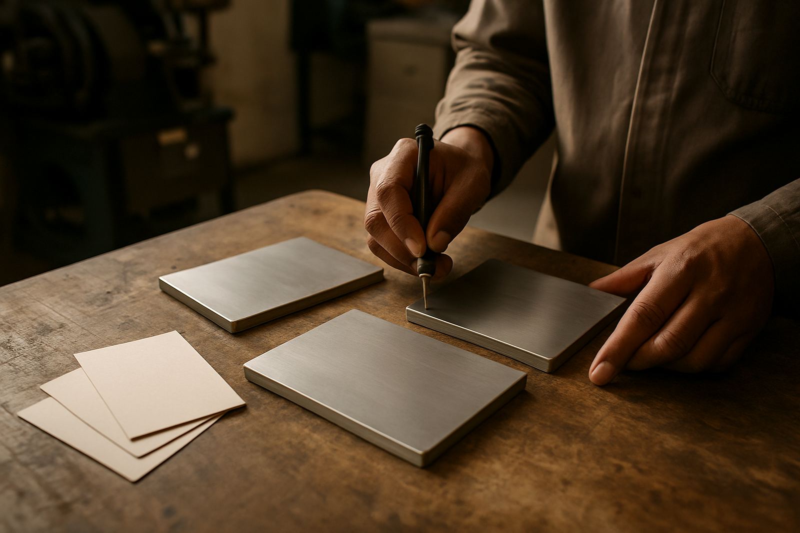
Good foil colour planning begins with clear instructions. We need to know the substrate, the finish, the size of the artwork and whether the job must suit offset, flexo or print finishing work. That gives the engraving and production team the right starting point, rather than guessing after the die is already made.
- Send the final substrate spec, including coating or laminate
- Tell us whether the item is coated, uncoated or textured
- Confirm the foil area size and whether details are fine or bold
- Say if the job needs embossing as well as foil
- Share sample impressions or previous job references where possible
When the brief is complete, we can advise on die design, engraving, counterforce matching and packing dispatch so the finished dies arrive ready for the press room. That saves time for print finishers and packaging houses across Pretoria, Durban, Bloemfontein and beyond.