
Why Natural Kraft Behaves Differently Under Heat and Pressure
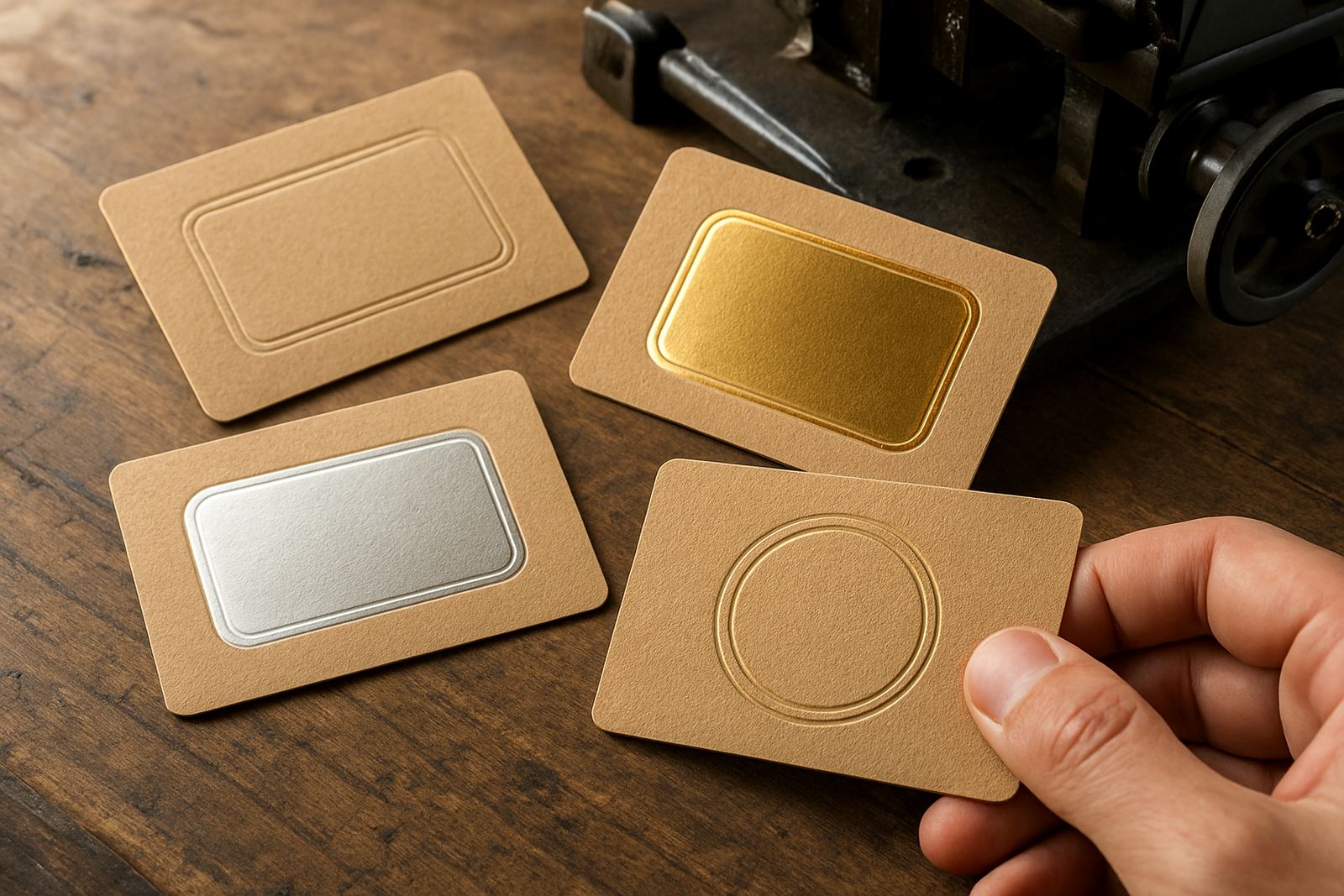
Natural kraft board is tougher and more forgiving than coated stock in some respects, yet it can also be unpredictable. The surface absorbs heat differently, fibres lift more easily, and the board can show every small flaw in pressure, registration or die depth. On a premium carton, that means a finish that looks crisp on the sample can turn patchy once the press is running at full speed.
In Johannesburg and across the country, many finishers work with mixed board batches because supply can change from one order to the next. One carton sheet may carry a slightly rougher face than the next, so the same die setting does not always give the same result. That is why kraft jobs often need a proper test impression before a full run, not just a visual check.
Common Problems Finishing Kraft Board
The most common issue is uneven impression. Kraft board can compress in one area and resist in another, which leaves parts of the stamp faint while other sections bite too hard. This is especially noticeable on large panels, fine text, and border lines that need to stay sharp across the full face.
- Flaking or fibre pick-up around the stamped area
- Shallow embossing that disappears on dark or busy artwork
- Over-crushed boards that lose carton strength
- Poor foil release when the die temperature is too high or too low
- Shadowing where the design is too close to a fold, glue flap or crease
Another issue is print-to-finish alignment. On kraft, small shifts show quickly because the natural tone gives less visual cover. If the artwork has a logo near the edge or a fine line on a pocket fold, the die has to be made with very tight registration allowances.
Choosing the Right Die Material for the Job
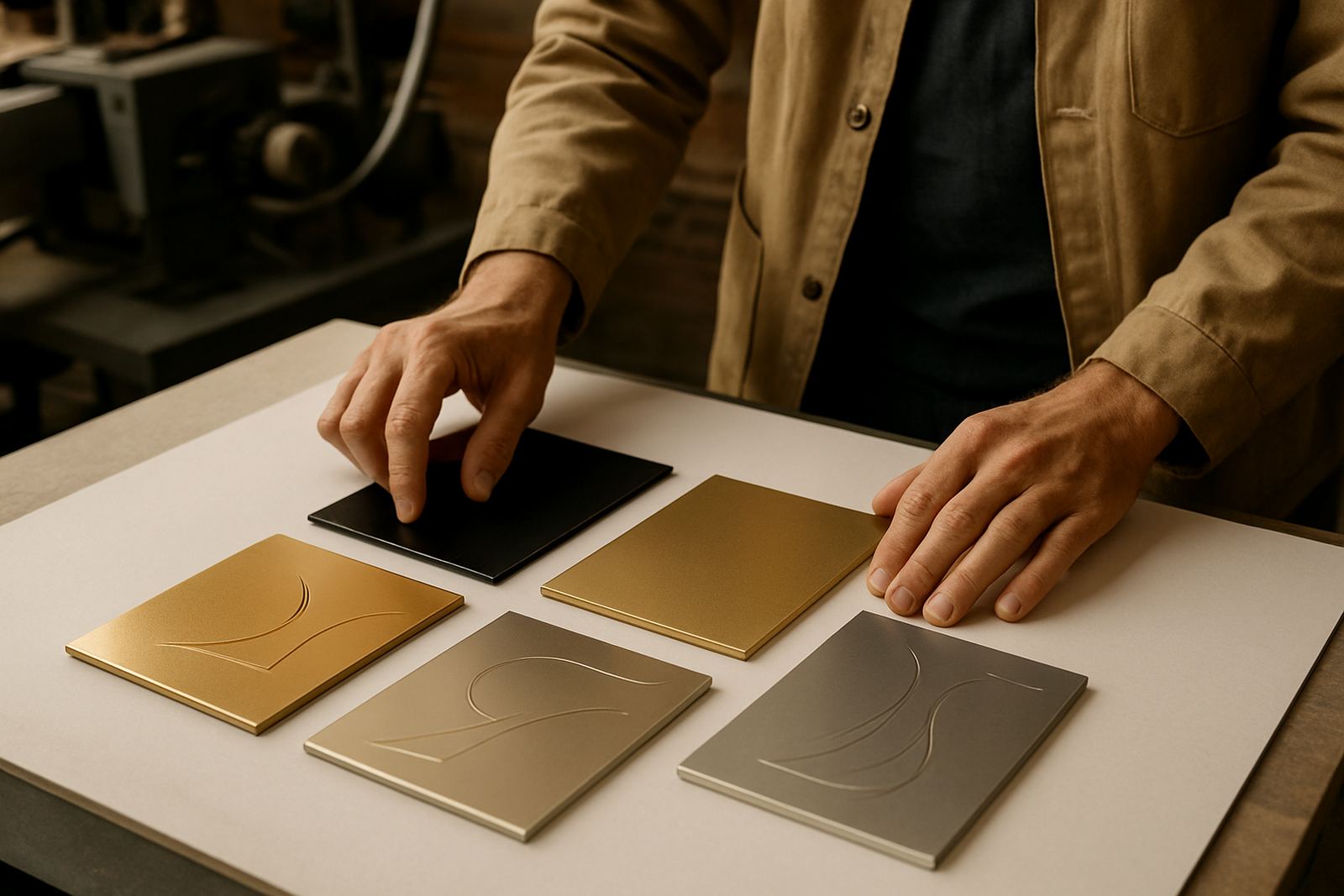
Not every kraft job needs the same die material. Brass is usually the better choice for longer runs, finer detail, and repeat work where the finish must stay accurate from start to finish. Magnesium can still be a practical option for lighter volumes, short runs, or urgent work when turnaround matters and the design is straightforward.
The real question is not only what looks best on the first sample, but what will hold up through the run. On kraft board, a die that is too soft may lose crispness quickly, while one that is too aggressive can bruise the board and create a rough edge. A good match between die depth, counterforce and press settings makes the difference between a neat job and a pile of rejects.
- Use brass for repeat orders and intricate artwork
- Use magnesium for shorter runs where speed matters
- Match the die depth to the board thickness and fibre density
- Check whether the finish needs emboss only, foil only, or a combination
Artwork Details That Need Extra Care on Kraft
Kraft board rewards strong, simple design. Thin strokes, tiny reversed text and very fine dot work can get lost because the natural surface already softens the edge of the impression. If the design is busy, it helps to simplify certain elements before engraving so the finished carton stays readable and clean.
As a rule, type below 6 pt on textured kraft is risky unless the layout is very controlled. Very narrow logos and linework also need careful checking against the actual carton size, not just the artwork file. A small error at prepress can become a big problem once the die is engraved and the job is on the press.
That is why artwork checks matter so much. A practical prepress review should confirm line weight, spacing, fold positions, bleed allowances and whether the impression sits too close to a crease. On a kraft carton, even a 1 mm adjustment can be the difference between a clean finish and a weak one.
How Counterforce and Sampling Prevent Waste
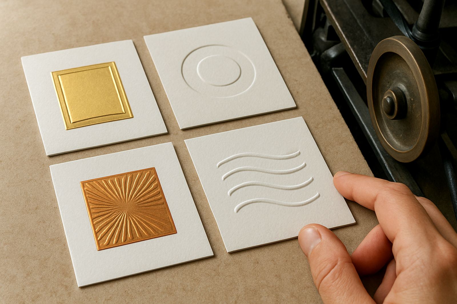
Counterforce matching is essential when embossing or stamping onto kraft board. The board may look solid, but its internal fibre structure changes from sheet to sheet and from manufacturer to manufacturer. If the counterforce is too hard, the board cracks or compresses. If it is too soft, the impression looks flat and unfinished.
Sample impressions are worth the time, especially for packaging houses handling premium retail cartons, food sleeves or gift packs. The first sample shows whether the design needs deeper engraving, a different pressure balance, or a cleaner edge around the logo. In many cases, a small adjustment before full production saves both material and time.
- Check the sample under normal light and not just pressroom light
- Look for cracking along folds and corners
- Confirm the foil or emboss holds after creasing and folding
- Test the finished carton in the actual packing sequence
A Local Example from a Fast Moving Packaging Run
A packaging house in Industria might receive a kraft carton job for a local food producer in Pretoria, with delivery due the same week. The artwork looks simple, but the logo must stamp clearly on a rough natural board and still fold neatly on the production line. If the die is undercut slightly or the counterforce is not matched, the carton can start showing bruising at the folds after only a few hundred sheets.
In a case like that, urgent turnaround is only useful if the technical details are handled properly. A clean engraving, accurate packing, and clear job filing for repeat orders mean the next batch can be produced faster with less rework. In South Africa, where load-shedding and courier delays can already compress production windows, there is little room for avoidable do-overs.
What Good Finishing Support Should Cover
For kraft board work, support should go beyond simply making the die. It should include artwork checks, die design, engraving production, die alterations, cleaning, damage assessment and packing dispatch. That full chain matters because natural board can expose any weakness in the process, from the first proof to the final carton in the warehouse.
Repeat ordering also becomes easier when the original job has been filed properly. If a client in Durban or Cape Town needs the same carton again, the file should show the exact board notes, impression depth, and any adjustments made on the first run. That kind of record keeping keeps the second job closer to the first, which is what most finishers want.
Natural kraft board is not difficult because it is poor material. It is difficult because it asks for better control. When the die, artwork and press settings are aligned, the result is clean, honest packaging that suits the board and the brand.