
Why shelf value starts with the first touch
When a customer scans a shelf, the eye catches shine, shadow and texture before it reads the copy. Foil stamping gives a clear flash of light, while embossing adds a raised form that feels purposeful in the hand. Together, they make a pack seem more considered, more premium and often more expensive, even when the printed substrate is simple.
That matters in South Africa where many categories compete on tight margins and fast retail decisions. A bottle neck tag, folding carton or luxury sleeve can gain a stronger shelf presence without changing the whole print run. The trick is to use the finishing effect where it supports the message, not where it fights with the design.
What foil does that ink alone cannot
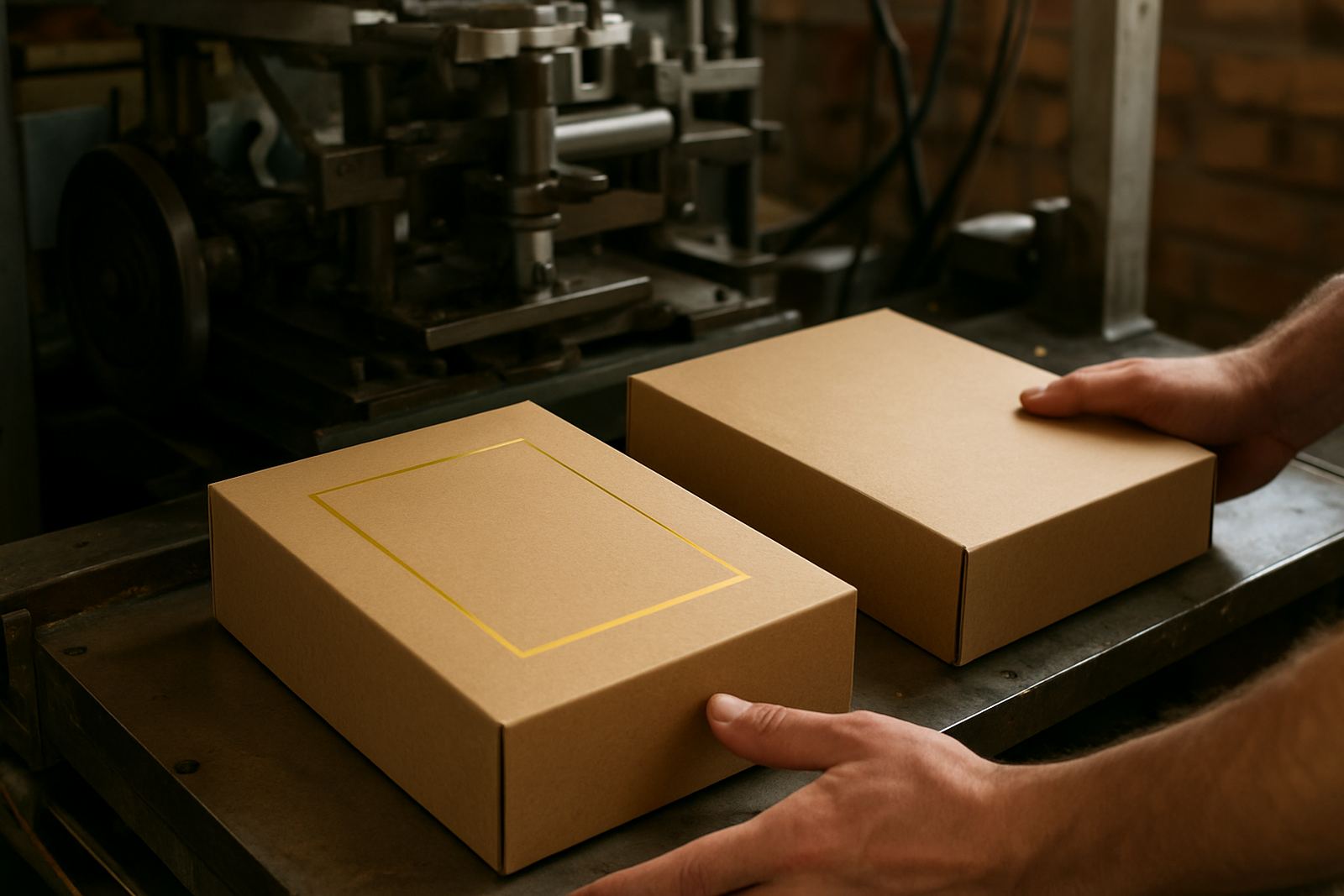
Foil adds a reflective surface that responds to aisle lighting, shopfront windows and even the harsh midday sun on delivery pallets. Gold, silver and coloured foils all behave differently, so the right choice depends on the product category and the mood you want on pack. A matte carton with a sharp foil mark often reads as controlled and premium, while a high-gloss combination can feel louder and more promotional.
For packaging houses in Johannesburg or Durban, the real advantage is not only appearance. Foil can help separate the brand mark from the background, guide the eye to a seal, or support a special edition without reworking the whole artwork. On shorter promotional runs this can keep production practical, especially when the client wants a strong result but the run size does not justify heavy changes.
- Use foil where the brand name, seal or crest needs instant recognition.
- Keep foil areas clean and well spaced to avoid a crowded result.
- Match the foil tone to the substrate colour and the shelf lighting.
- Allow enough pressure and clean edges so the finish looks crisp, not patchy.
Why embossing changes the way a pack is judged
Embossing creates depth, and depth reads as care. A raised logo or pattern gives the finger something to feel, which can nudge the customer into a slower more attentive interaction with the pack. That extra second matters. It can be the difference between a product that blends in and one that gets lifted off the shelf.
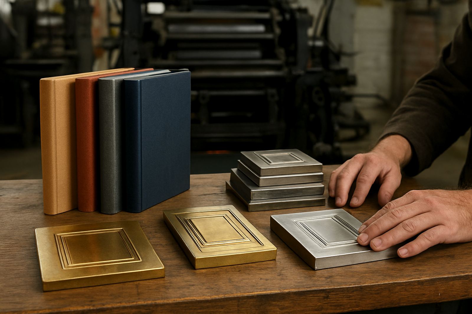
Embossing is especially useful for premium food, cosmetics, stationery and gift packaging. It can suggest weight and craftsmanship without adding much material cost. When paired with a foil mark, the raised detail catches both light and shadow, giving the impression of a much more expensive finishing process than ink alone can achieve.
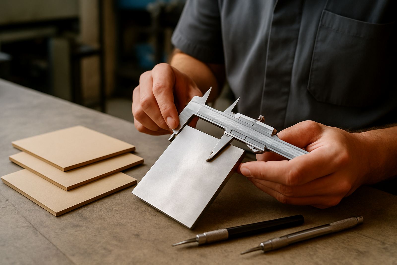
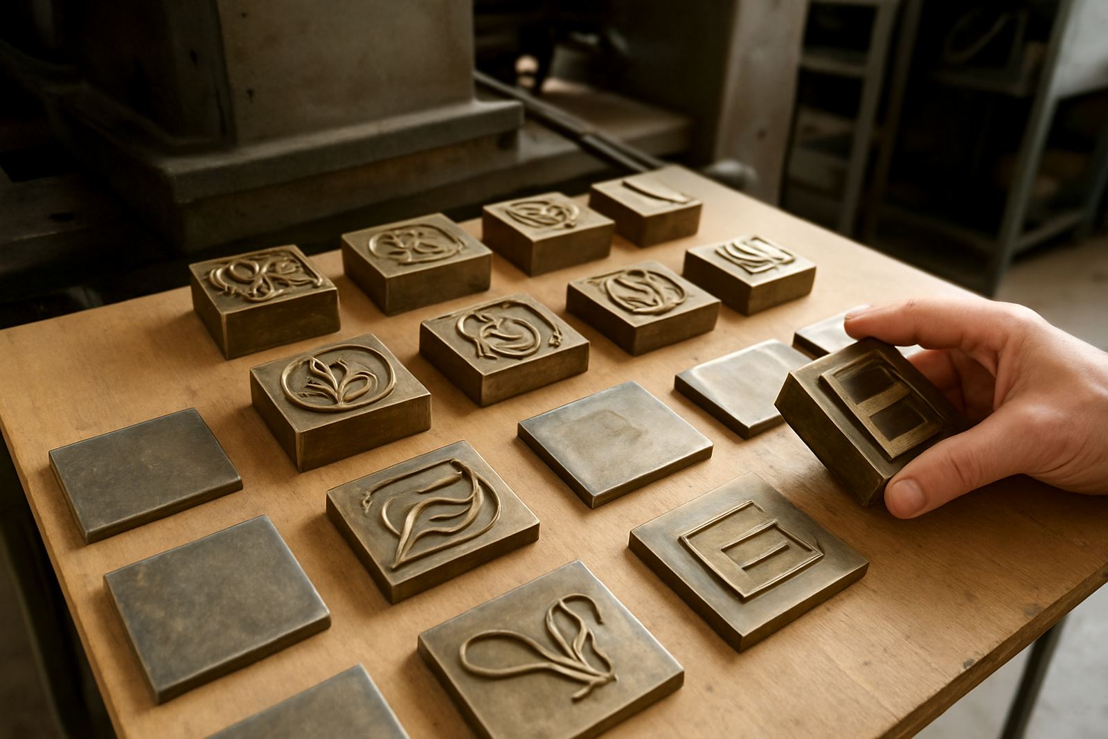
For practical work, the most important part is the die. If the brass or magnesium die is not accurate, the emboss can flatten, crack or lose definition on the corners. That is why artwork checks, counterforce matching and sample impression advice are worth the time before a full production run begins.
The practical side: choosing the right effect for the job
Not every pack needs both foil and emboss. Some designs only need one strong focal point, especially if the print is already busy with colour or photography. A well planned die can save time on press and reduce the risk of rework. In a market where deadlines are tight and load-shedding can disrupt schedules, planning the finishing step properly is a business advantage not just a design choice.
As a rule, use foil when the goal is visibility and use emboss when the goal is tactility. Combine them when the pack needs both, but keep the artwork disciplined. Small text should be avoided in raised areas, fine lines need careful spacing, and deep embossing should be tested on the actual board or label stock before the order is signed off. That way the final result is clean and consistent across the run.
- Choose brass for long runs, finer detail and repeat use.
- Choose magnesium when the job calls for quicker turnaround and lighter duty.
- Check board grain, coating and thickness before finalising the die.
- Ask for a sample impression on the same material where possible.
A Johannesburg example that shows the difference
Think of a mid-range confectionery box going into retail chains in Sandton, Pretoria and regional stores across Gauteng. The printed artwork might already look good, but once a foil seal and a raised logo are added the pack starts to read differently. It feels less like a bulk item and more like a giftable purchase. That shift can support pricing, especially when the same product sits next to plain cartons with little surface interest.
The same principle applies to export cartons leaving Industria for customers in Cape Town, Gqeberha or the coast where humidity can be a factor. A properly made die and correct counterforce matching help the finish hold its shape. If the pack is moving through different climates and handling conditions, the impression has to stay sharp from dispatch through to the shelf.
For many local clients, the best results come from a practical sequence: artwork checked early, die design approved, sample impression reviewed, then dispatch packed carefully for the finisher. That reduces surprises and keeps the brand presentation consistent from one batch to the next.
Keeping premium effects consistent across repeat orders
Premium packaging is not only about one good first run. It is about repeating the same quality when a client reorders six months later or changes only a minor artwork detail. Job filing, die cleaning and die alterations matter here because they protect the original look. If a plate or die is not stored properly, fine detail can shift and the next batch may not match the first.
Good repeat control is especially useful for brands with stock moving through Johannesburg, Pretoria, Durban, Cape Town, Bloemfontein, Polokwane and Mbombela. A couriered die should arrive packed safely, clearly labelled and ready for the next production slot. When the finishing partner knows exactly which job file, impression depth and substrate were used, the result is more predictable and the shelf value stays intact.
- Keep a record of substrate, foil type and press settings for each job.
- Review worn dies before repeat production starts.
- Use damage assessment when a pack arrives with dull or uneven results.
- Pack dies carefully for courier transit so edges and faces stay protected.
What to ask before you approve a premium finish
Before you approve the final artwork, ask how the foil and emboss will behave on the actual stock, not just on the proof. Ask whether the counterforce has been matched, whether the die will hold the detail you want, and whether the finish will still look strong under retail lighting. Those checks save time and money later on.
If the pack is for a high-value product, a launch or seasonal campaign, give the finisher enough lead time for testing and corrections. Urgent turnaround is possible on many jobs, but the best shelf result usually comes from careful preparation. A premium finish should feel deliberate, crisp and well judged. That is what shoppers notice, even when they cannot name the process behind it.